

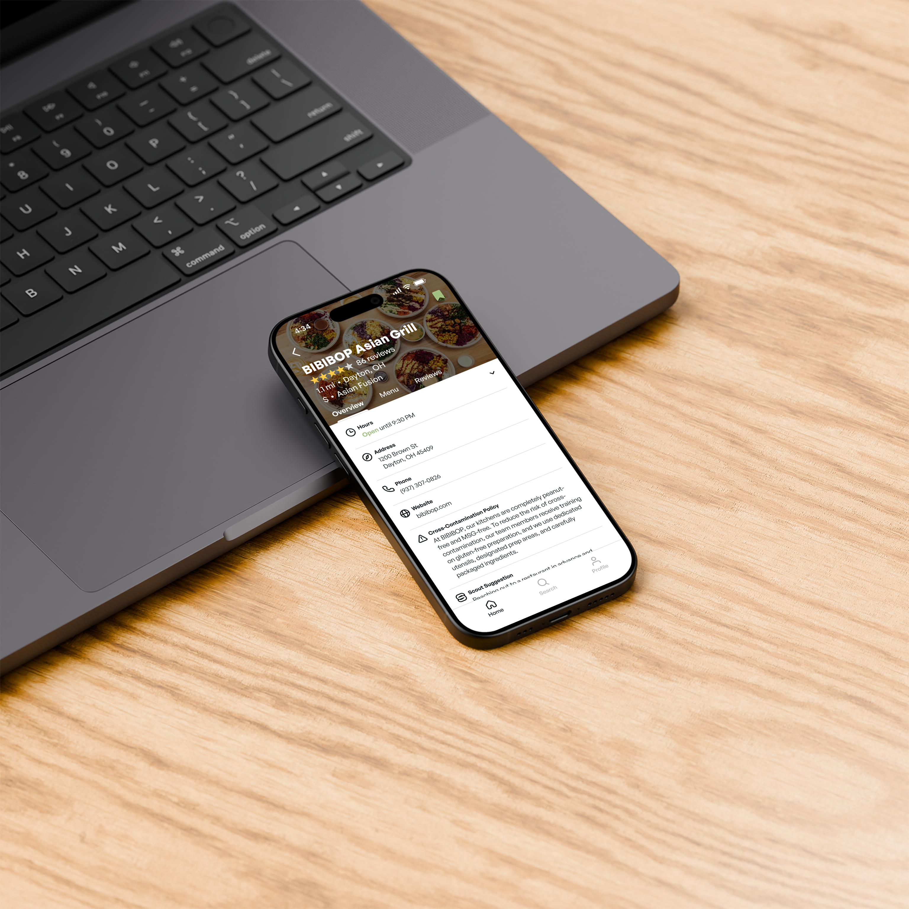

It is incredibly difficult to eat comfortably with a dietary restriction, especially while dining out. Scout is an app that aims to make this experience easier, placing a focus on user needs and transparent communication.
Duration
16 weeks
Disciplines
UX/UI Design
Wireframes
Prototype
CONTEXT
First-Hand Experience
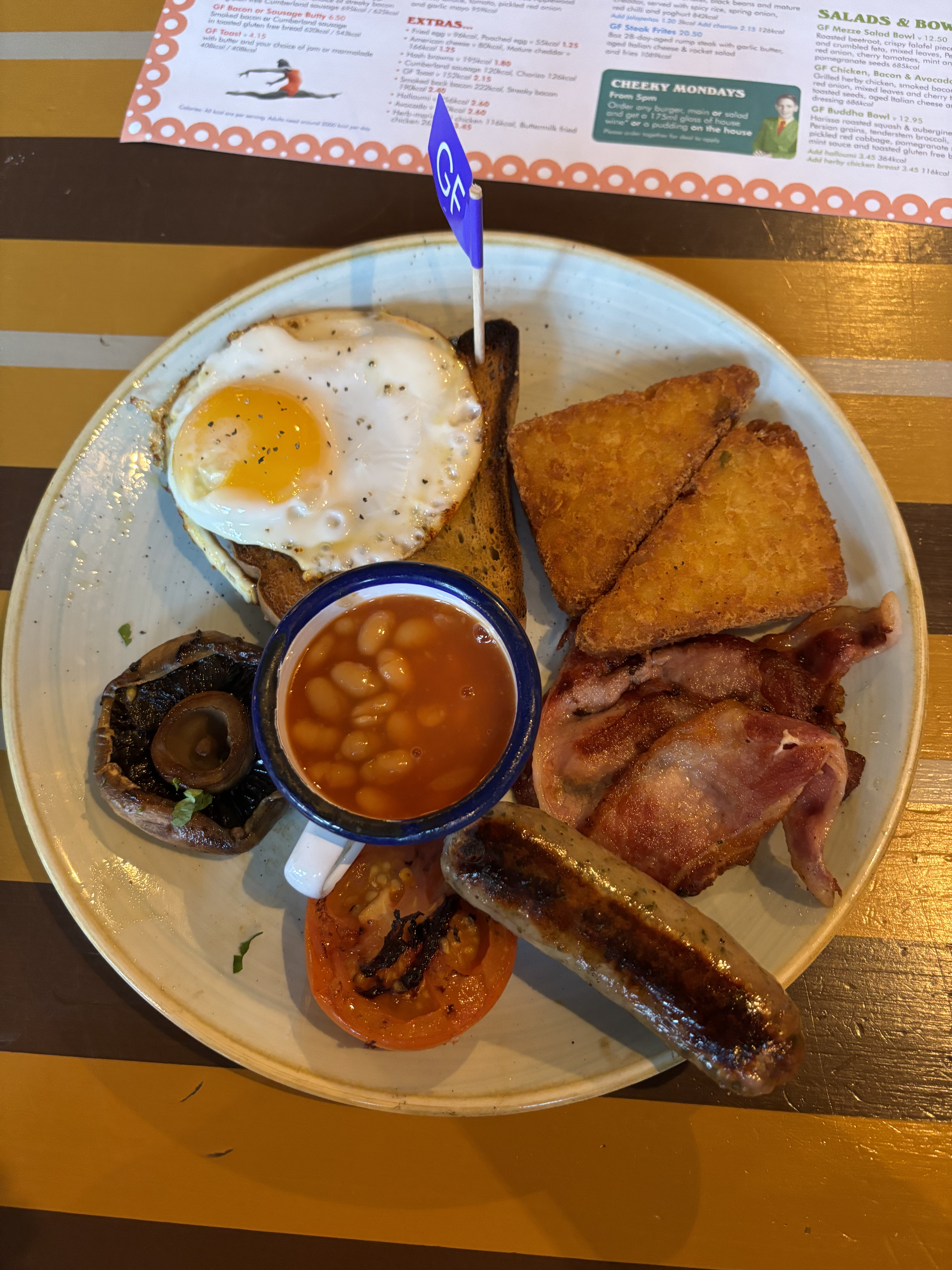
This project was inspired by a friend’s Celiac Disease diagnosis in 2024. The day after their diagnosis, we spent over an hour trying to find a restaurant they felt safe eating at. It didn’t take long for us to realize that this struggle never really goes away, and it’s still a massive challenge for them to this day.
MARKET RESEARCH
Casting a Wide Net
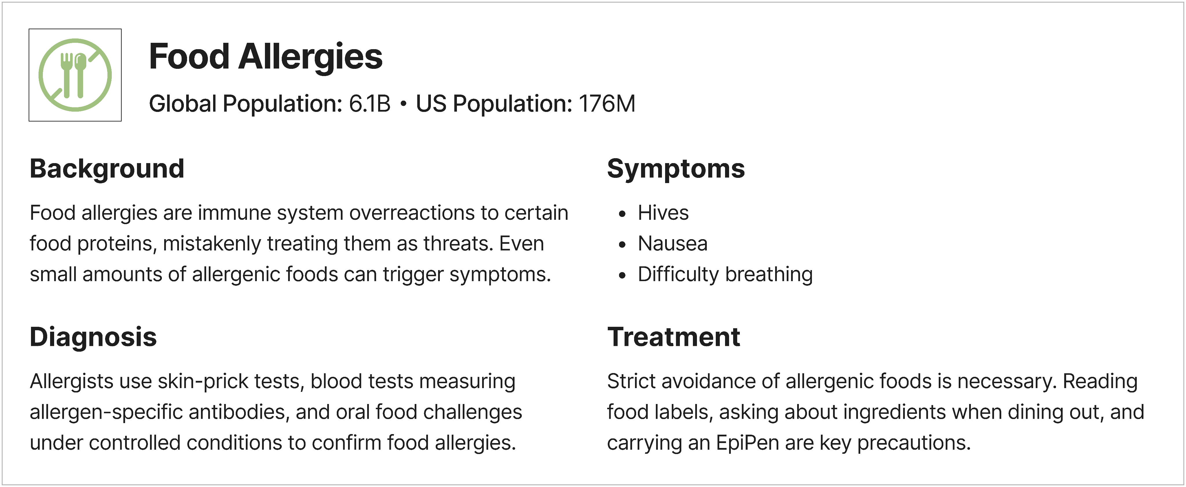
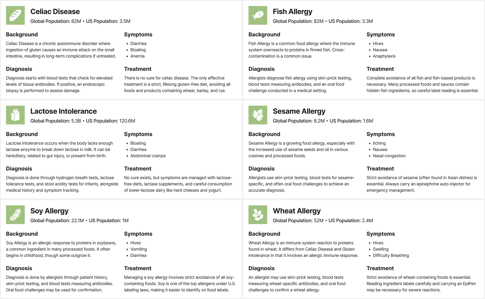
In researching Celiac Disease, I quickly discovered that food allergy and dietary restriction communities were far larger than I had expected, and that many people faced similar challenges when dining out.
Identifying Differences
Food allergies and dietary restrictions are often grouped together, but they can differ significantly. Factors such as reaction severity and cross-contamination risks vary greatly.
COMPETITIVE ANALYSIS
Fragmented & Limited
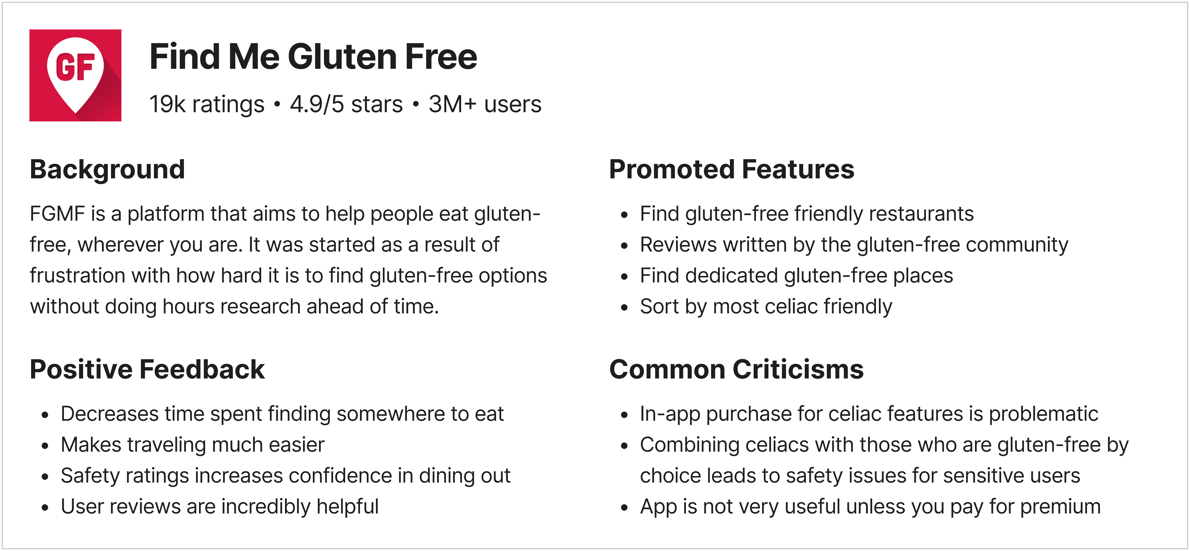
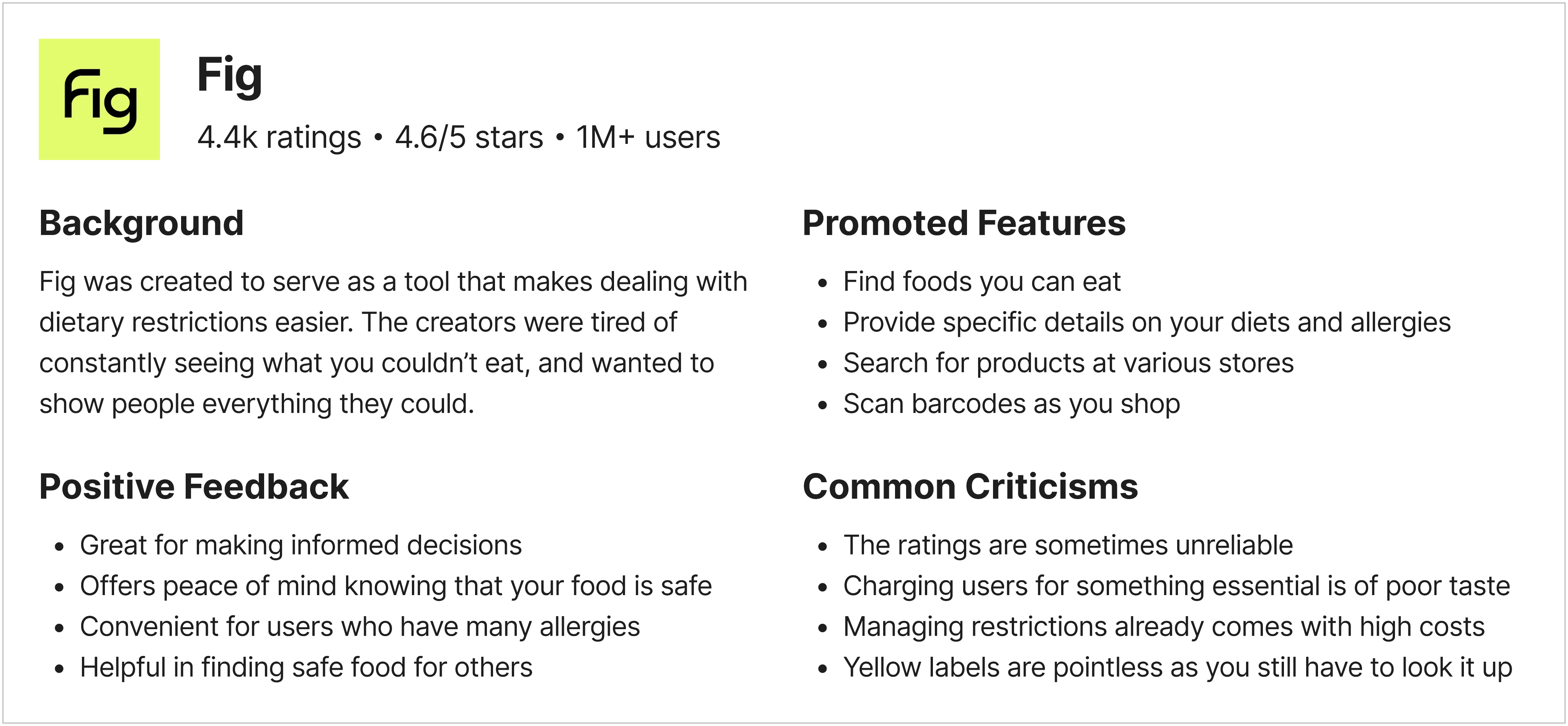
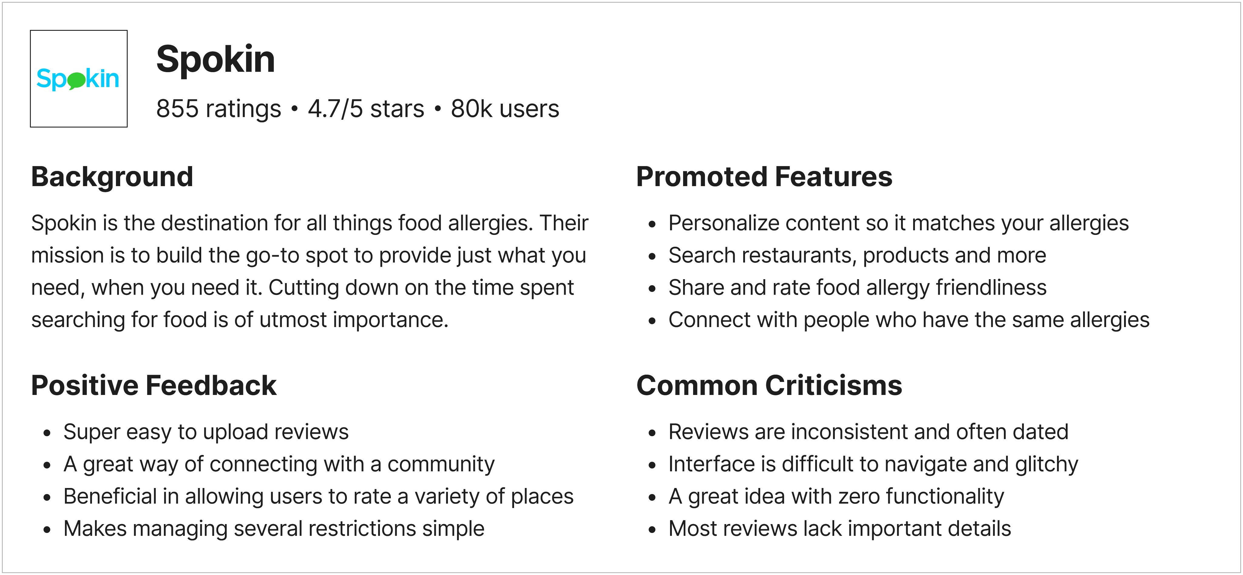
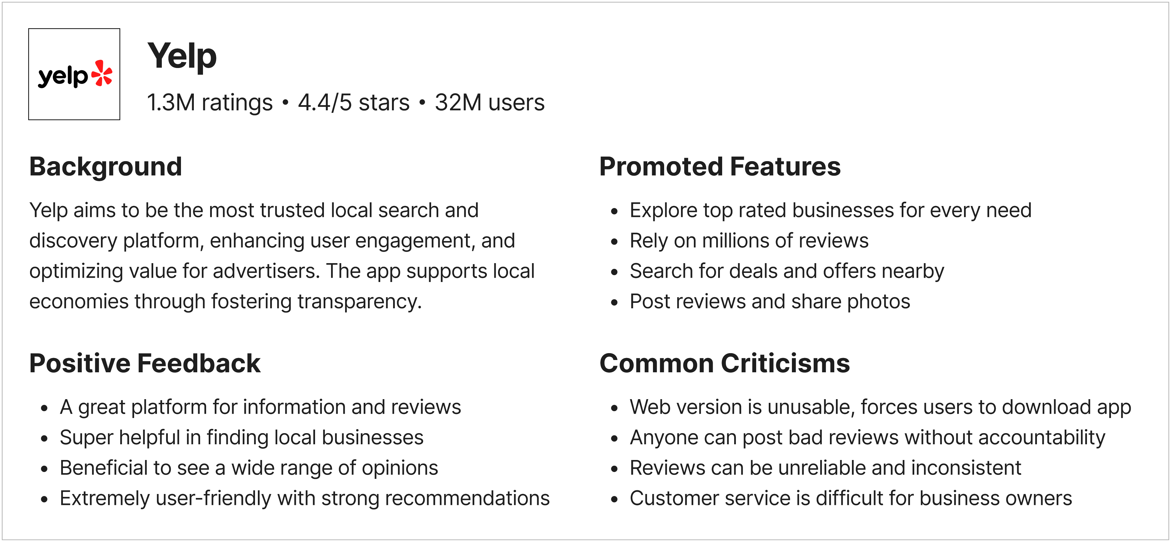
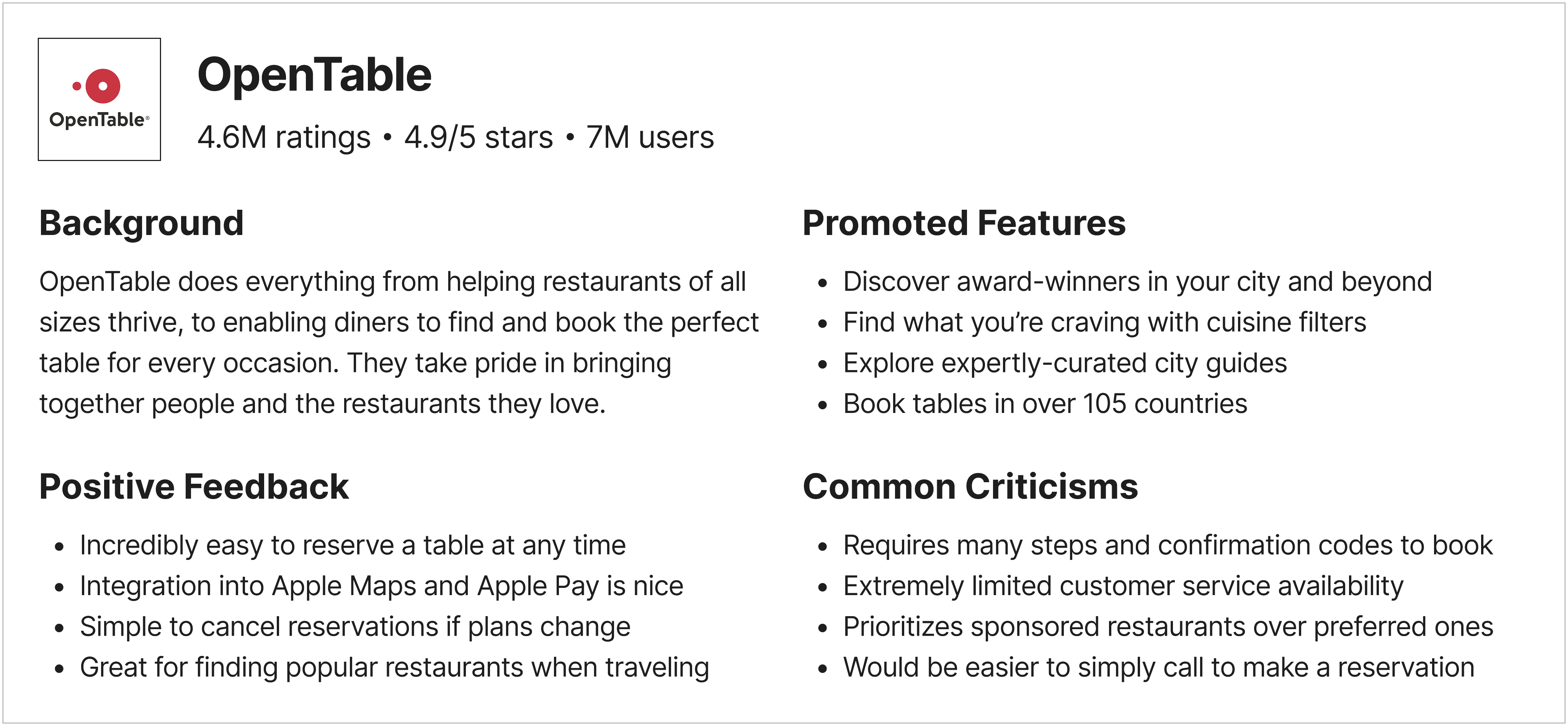
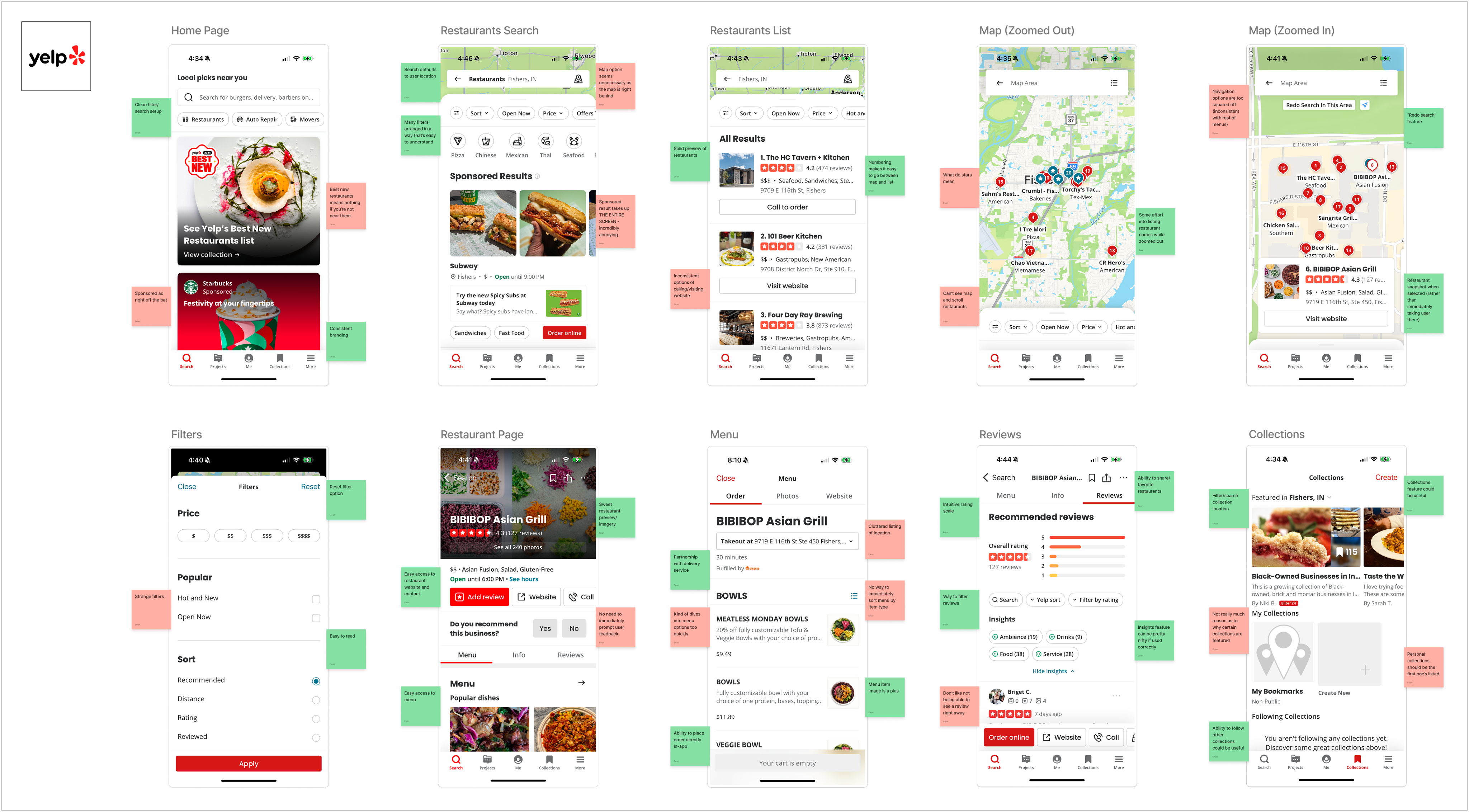
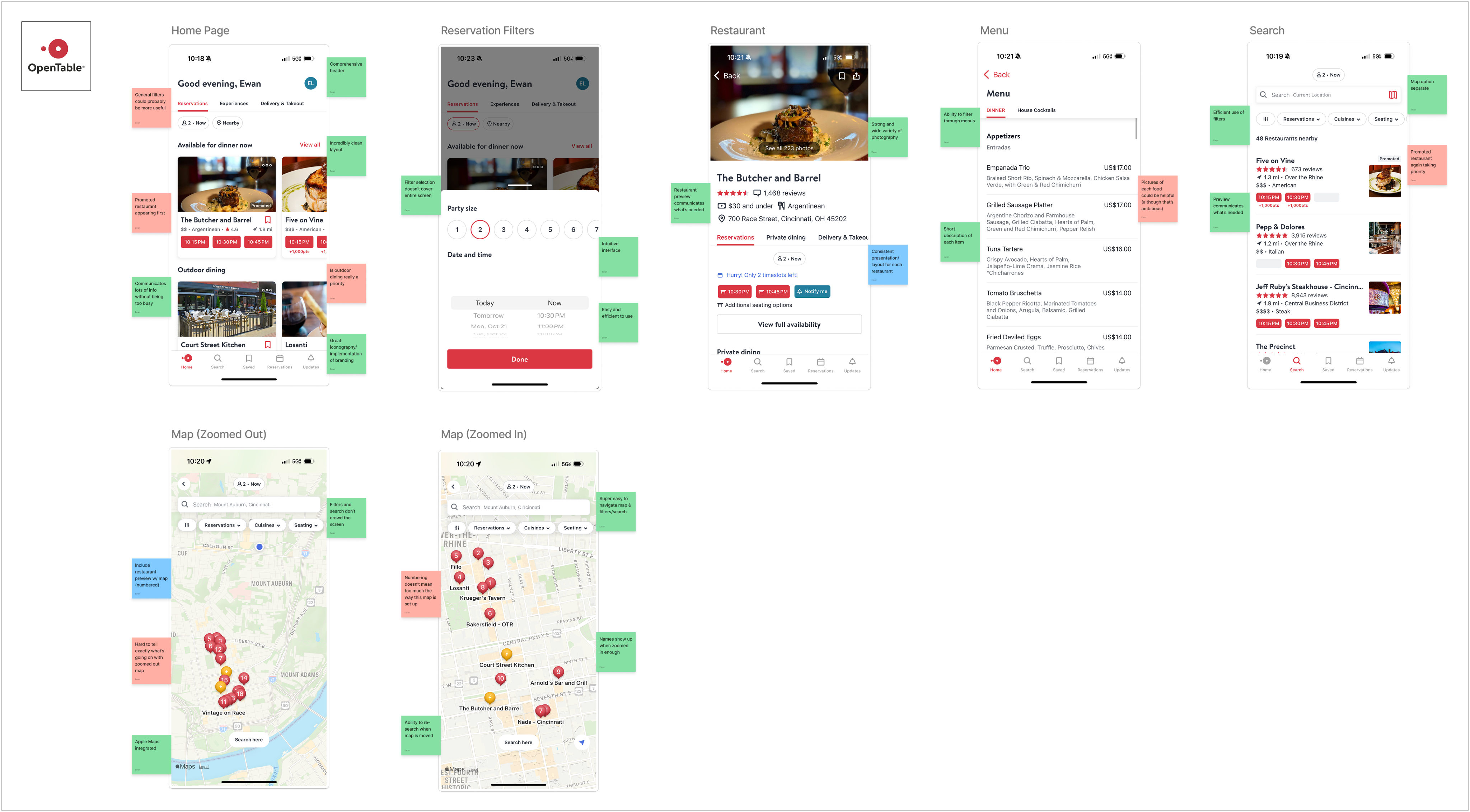
While resources do exist for these communities, they are extremely limited in both functionality and reach. There is currently no single place people can turn to for reliable help finding safe dining options.
Building Connections
One of the most valuable features offered by existing apps is their ability to connect users directly with restaurants. Clear communication and direct access to information can go far in building trust.
AFFINITY DIAGRAMS
Thorough Analysis
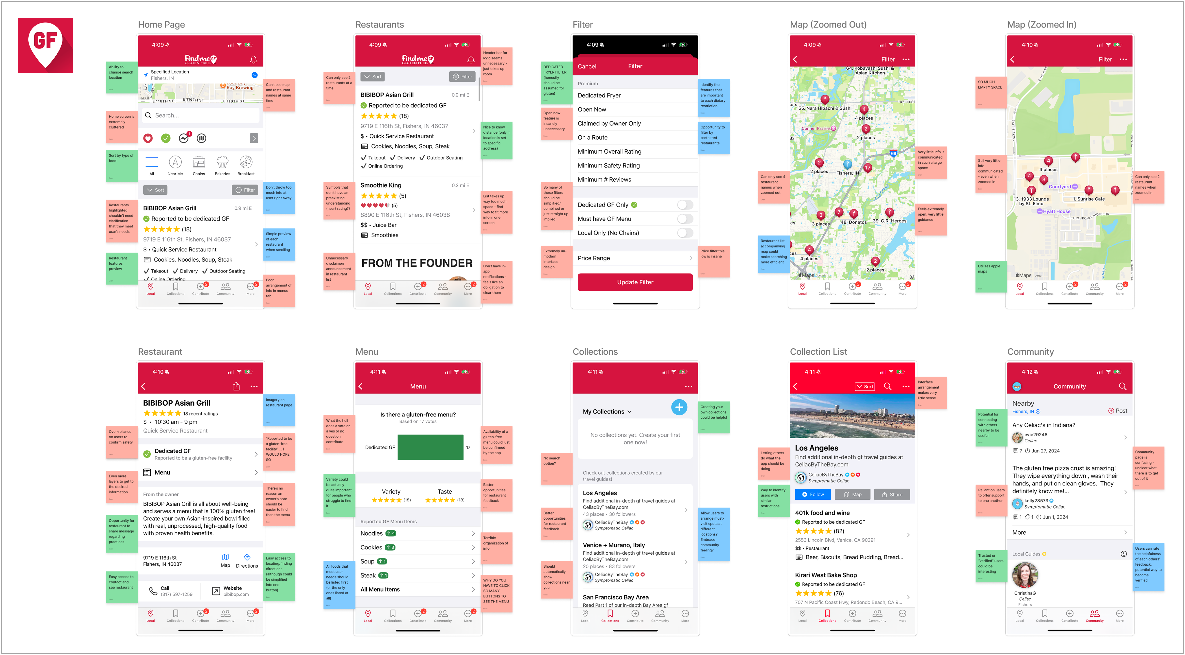
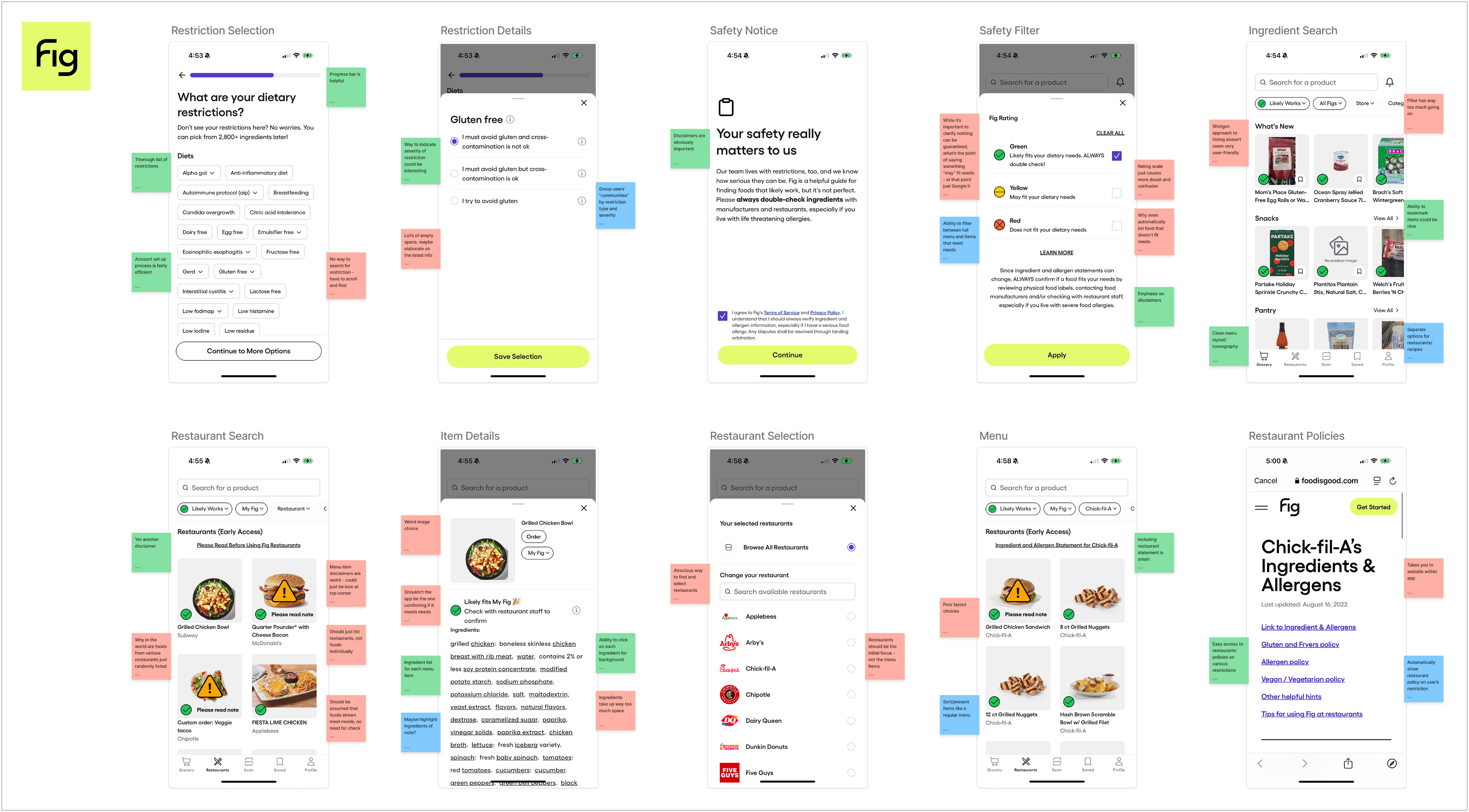
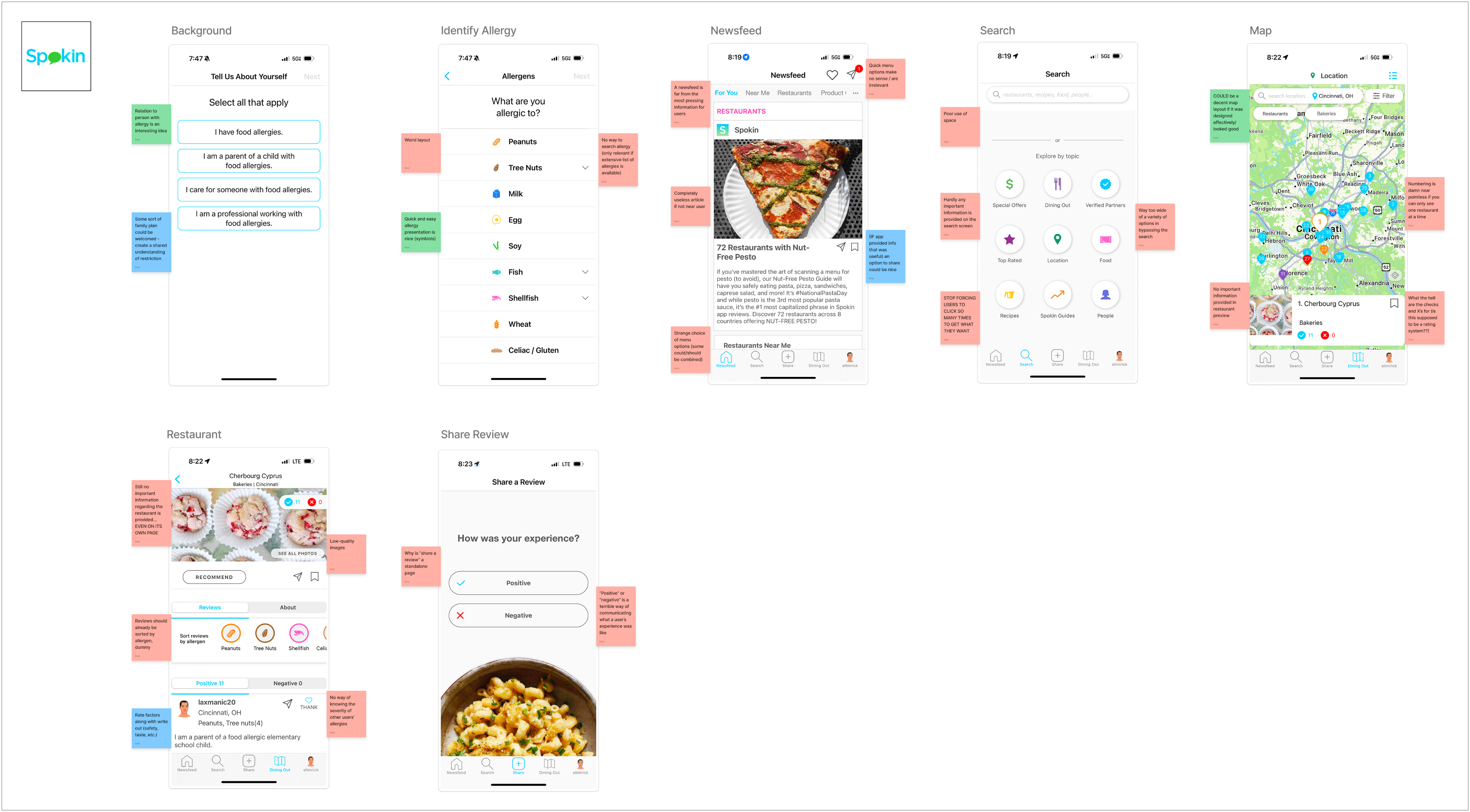
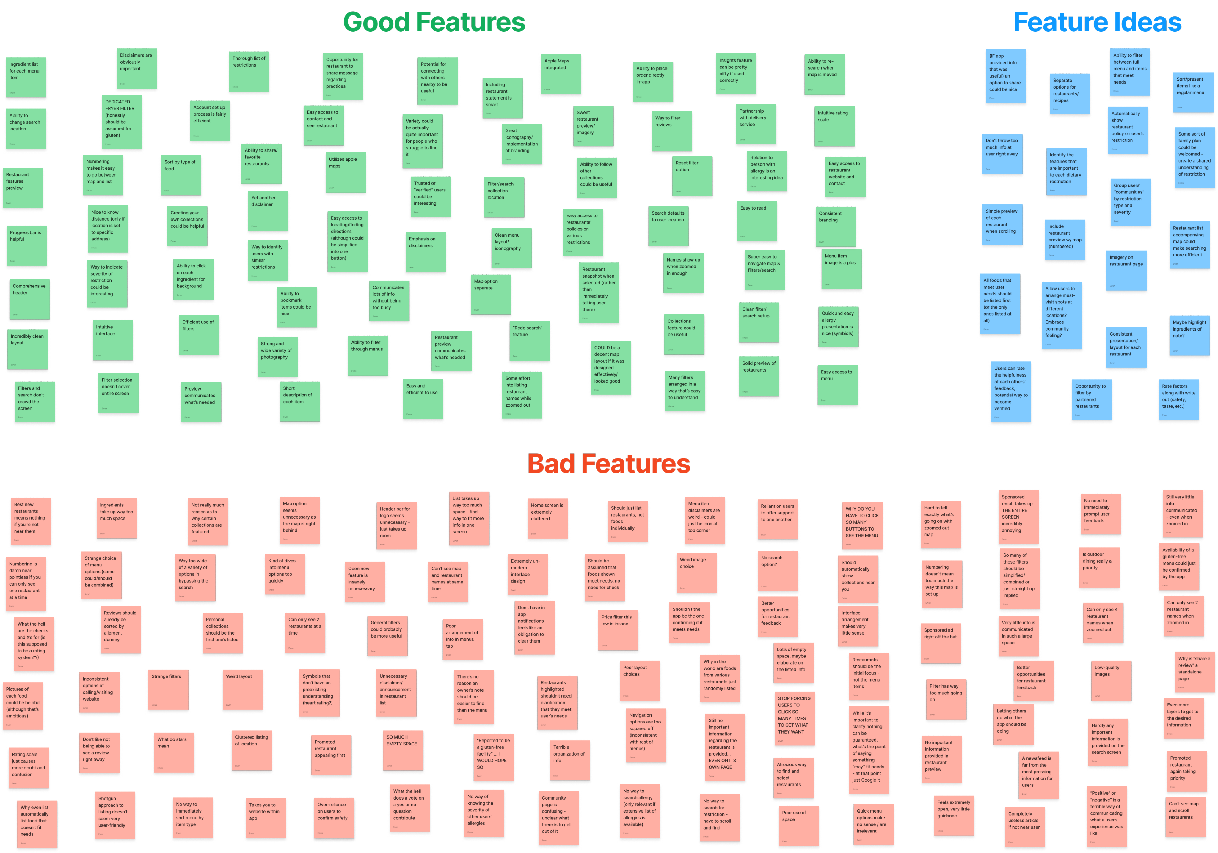
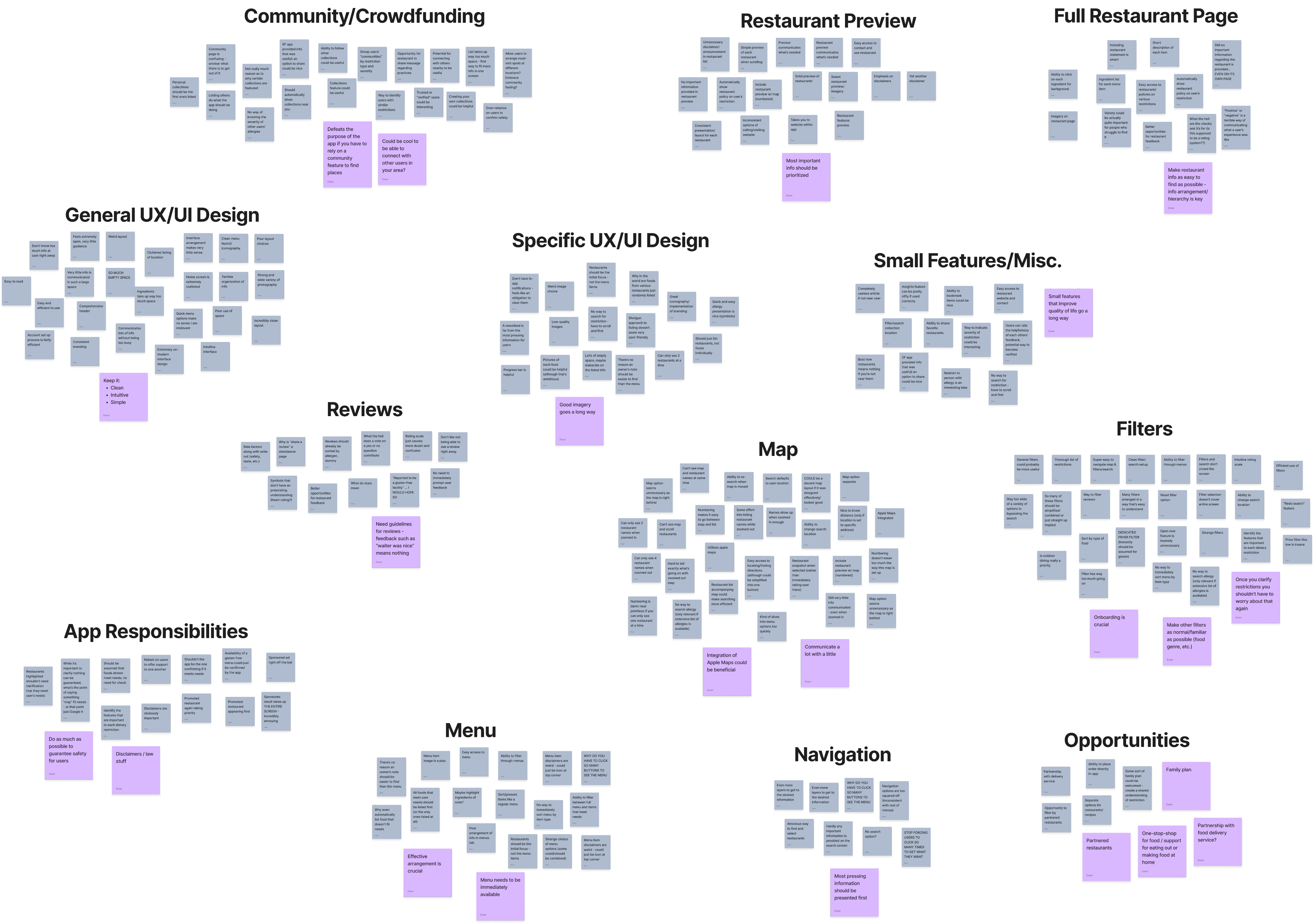
To see what was already working, I took a deep dive into existing apps. This process helped me identify common strengths, recurring pain points, and ideas that could help create a better overall experience.
The Opportunity
Most options currently rely on crowdsourced information, which can be inconsistent and inaccurate. By sourcing dietary-filtered menu information directly from restaurants, a more reliable connection could be created between restaurants and these communities.
DESIGN GOALS
Convenience
Significantly reduce the time spent searching for food.
Safety
Ensure users can dine out without any risk to their health.
Confidence
Offer a return to normalcy in the dining experience.
INFORMATION ARCHITECTURE
Simplicity
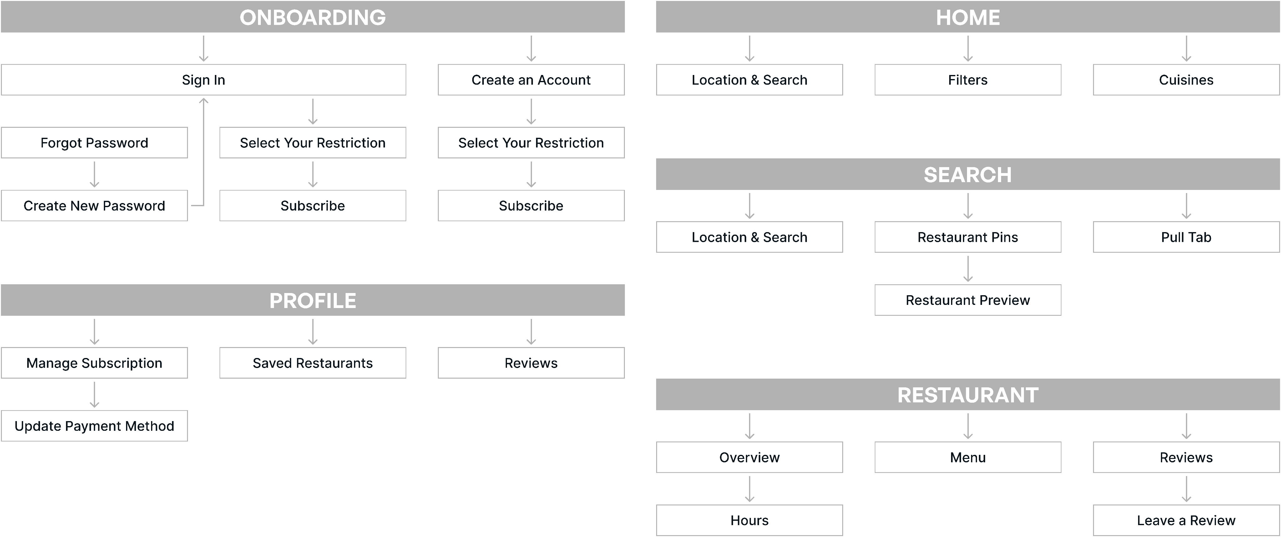
My primary aim with this initial mapping was to keep interactions intuitive so users could spend as little time as possible searching for food.
CONCEPTUALIZATION
Effective Arrangement
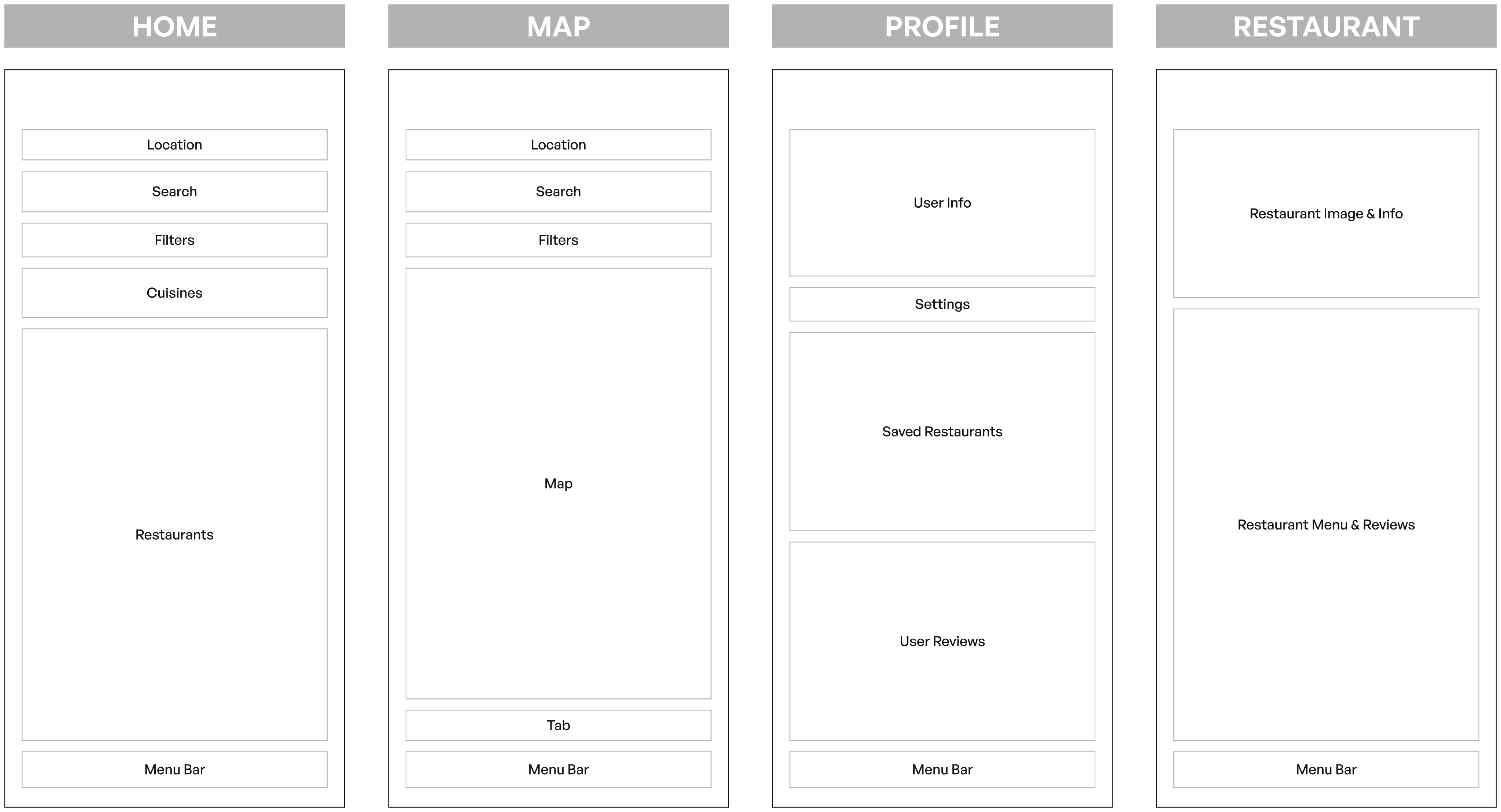
I found it extremely beneficial to keep similar features in the same location across pages. Consistency throughout the app will help users quickly find important information.
LOW-FIDELITY PROTOTYPE
Understanding User Flow
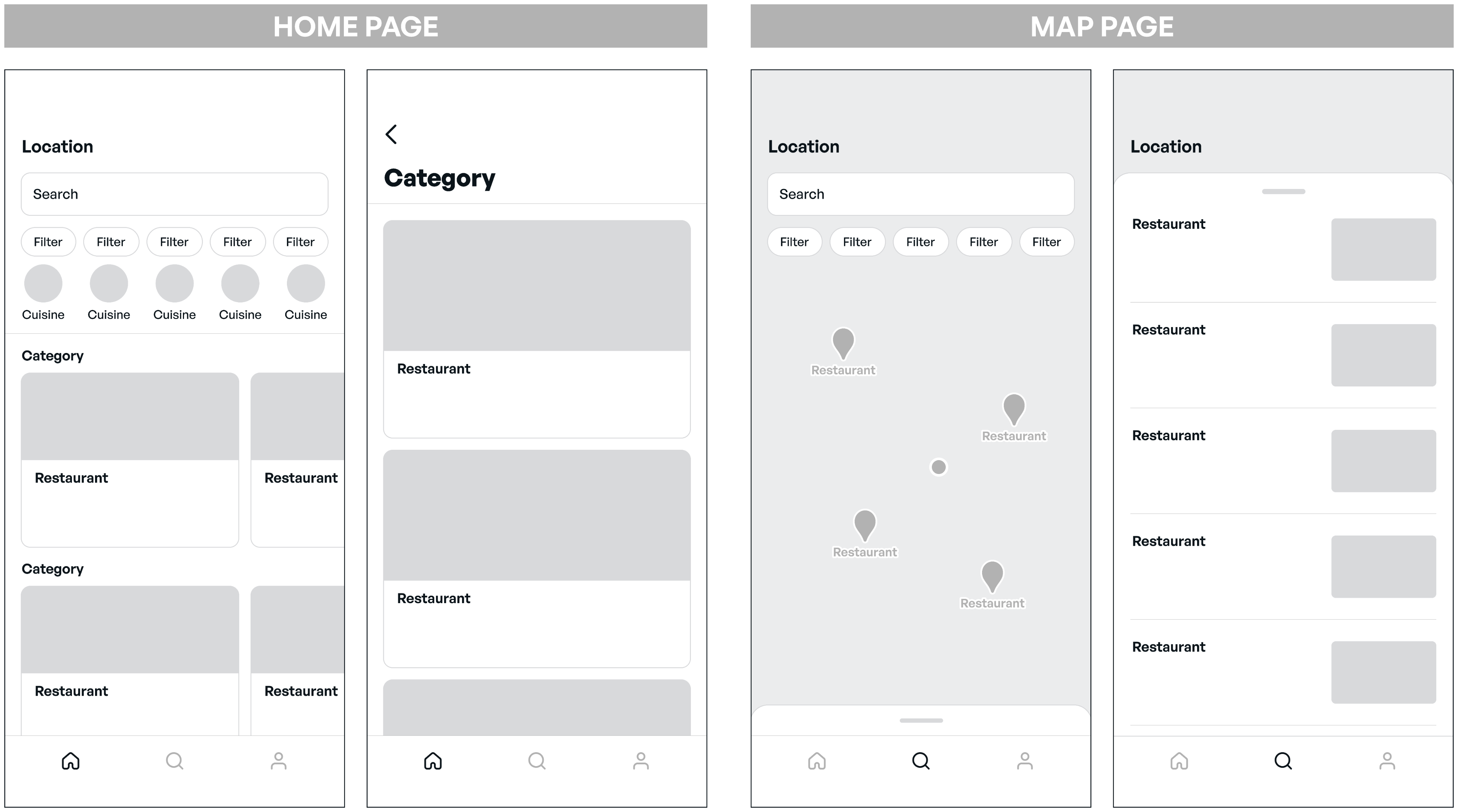
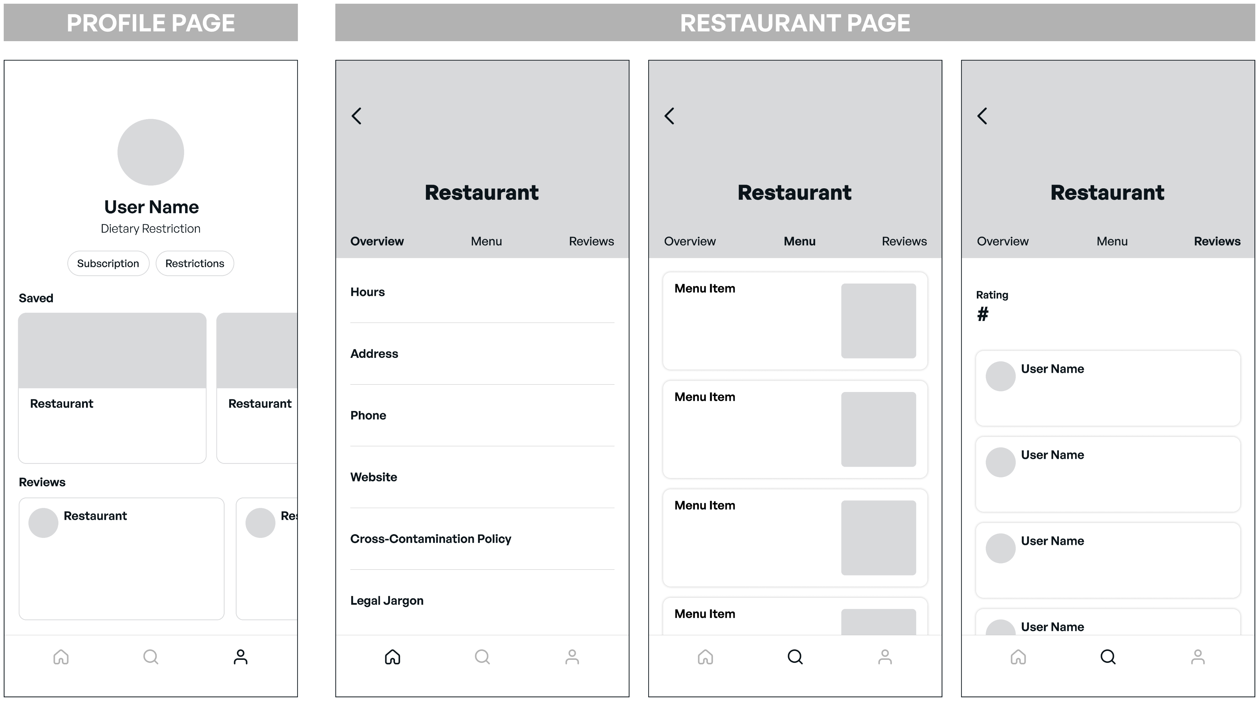
As the prototype began to take shape, it became clear that too much information could easily overwhelm users. The challenge was deciding what information was essential and what could be removed to keep the experience focused.
USABILITY TEST 1
Attention to Detail
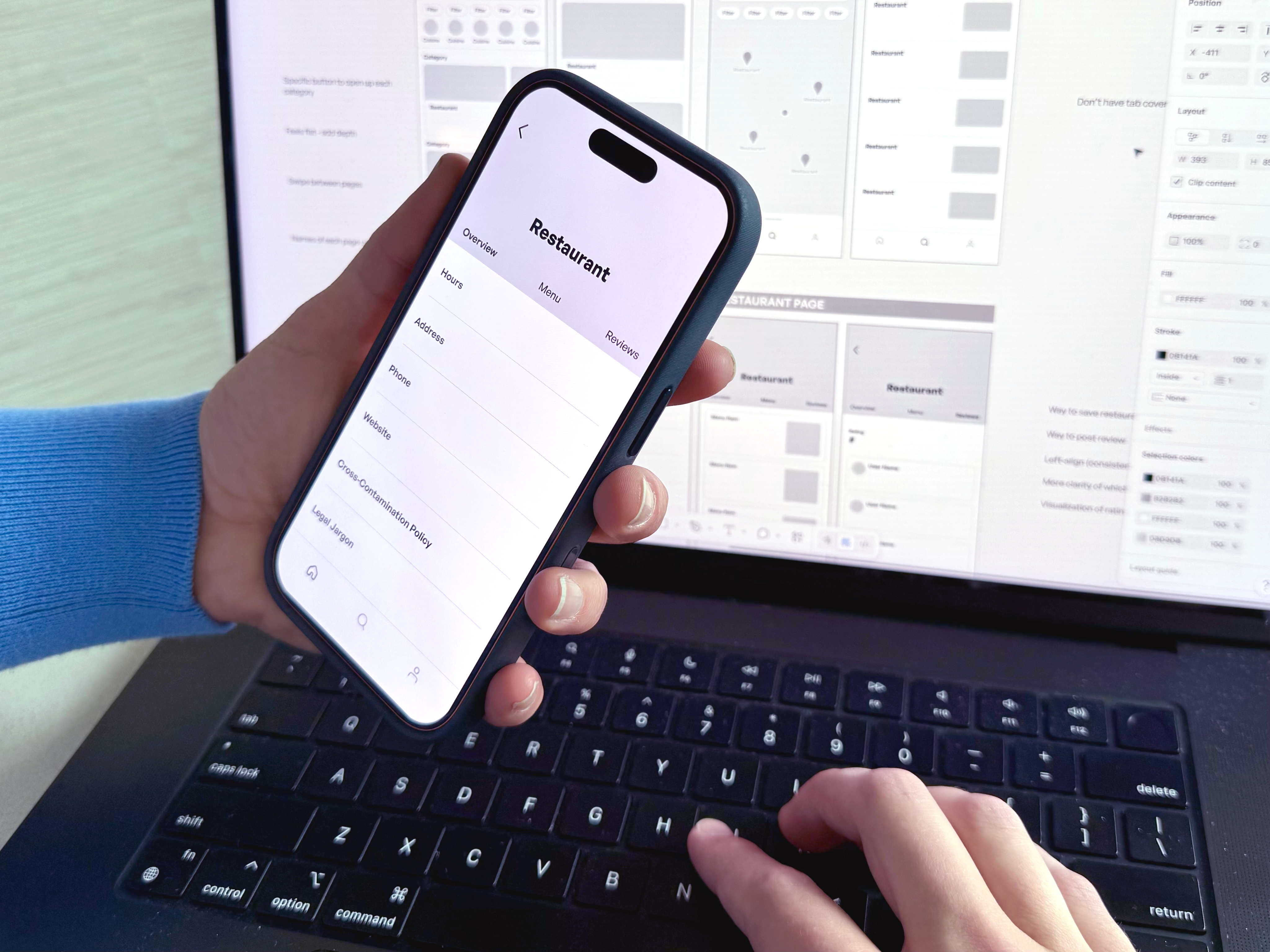
One of the biggest takeaways was the importance of intentional design decisions. Consistent layouts and visual patterns were well received, reinforcing the need to maintain a cohesive experience across the app.
MID-FIDELITY PROTOTYPE
Expanding Structure
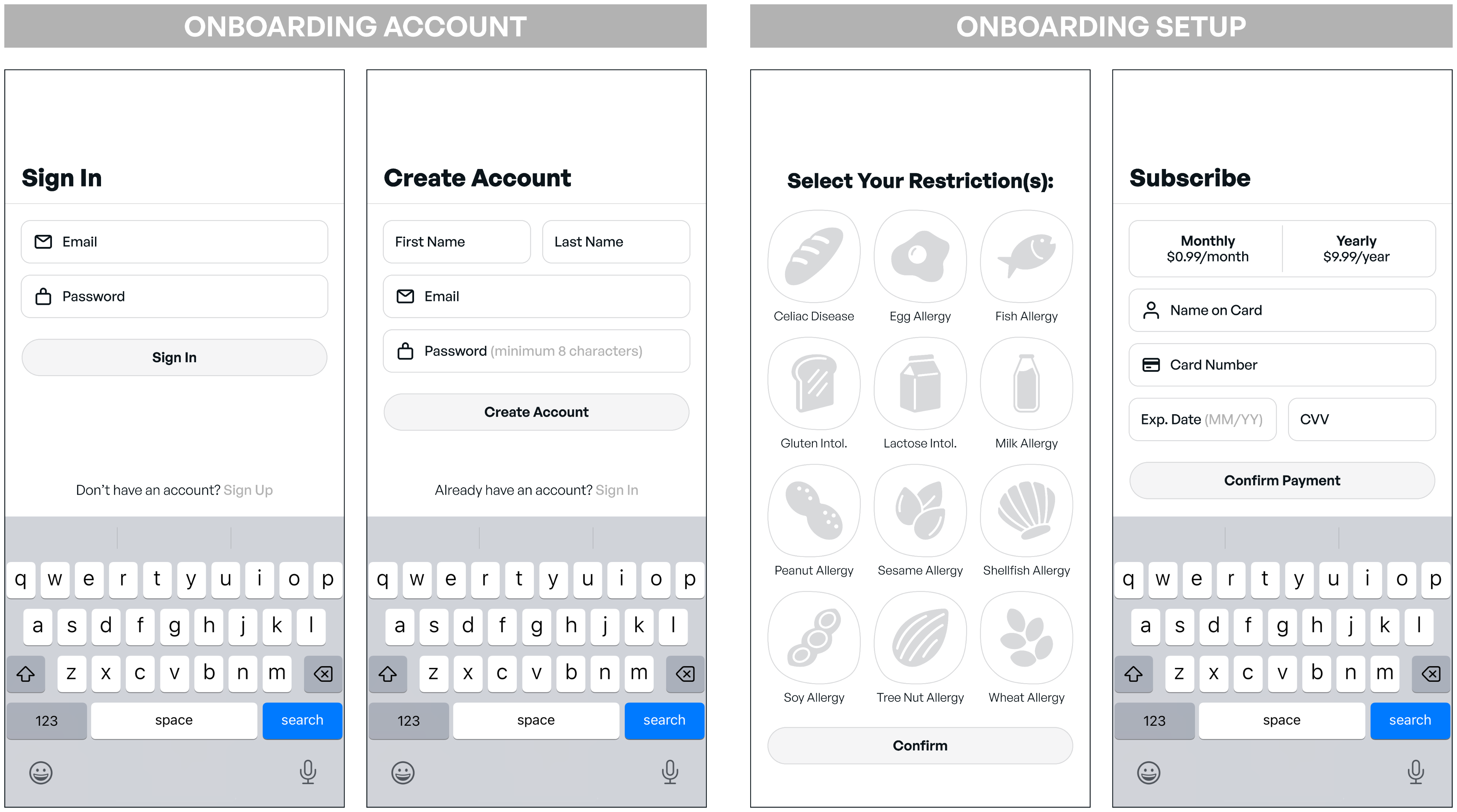
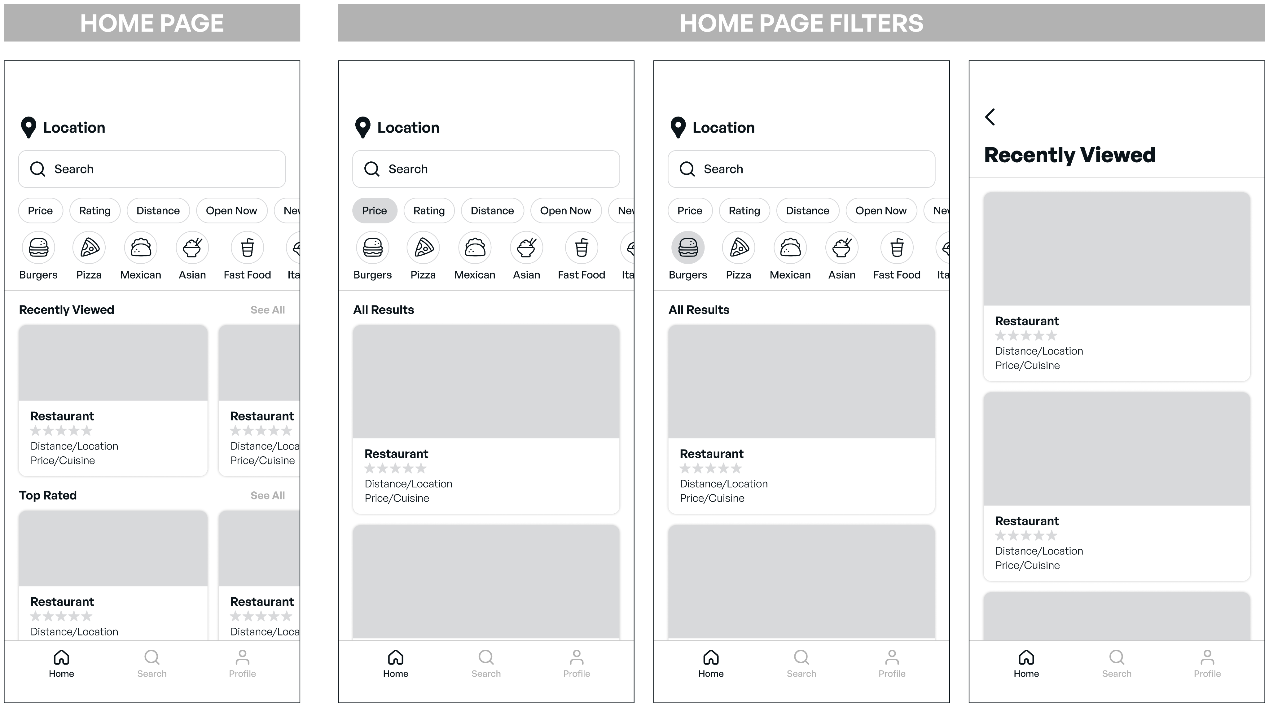
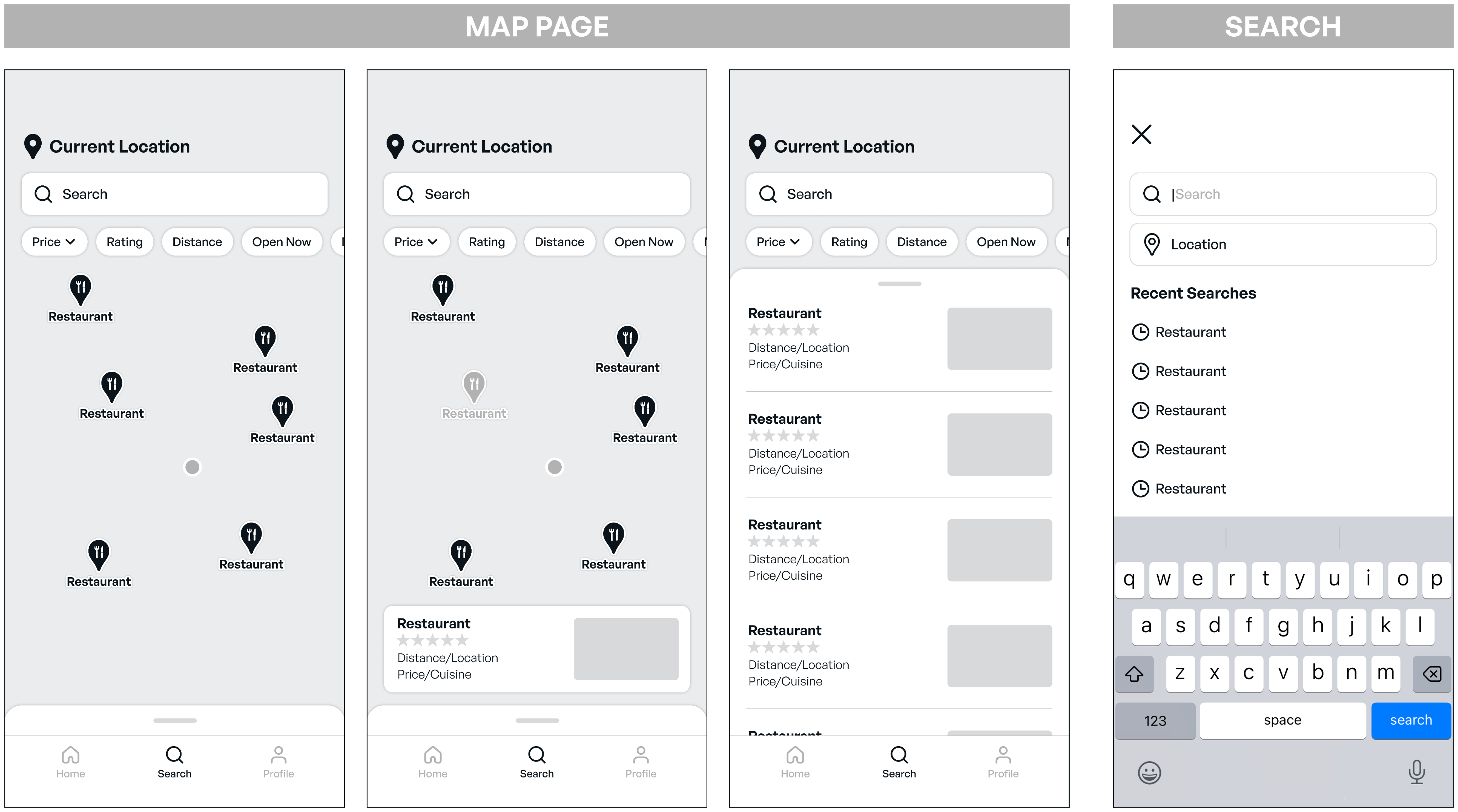
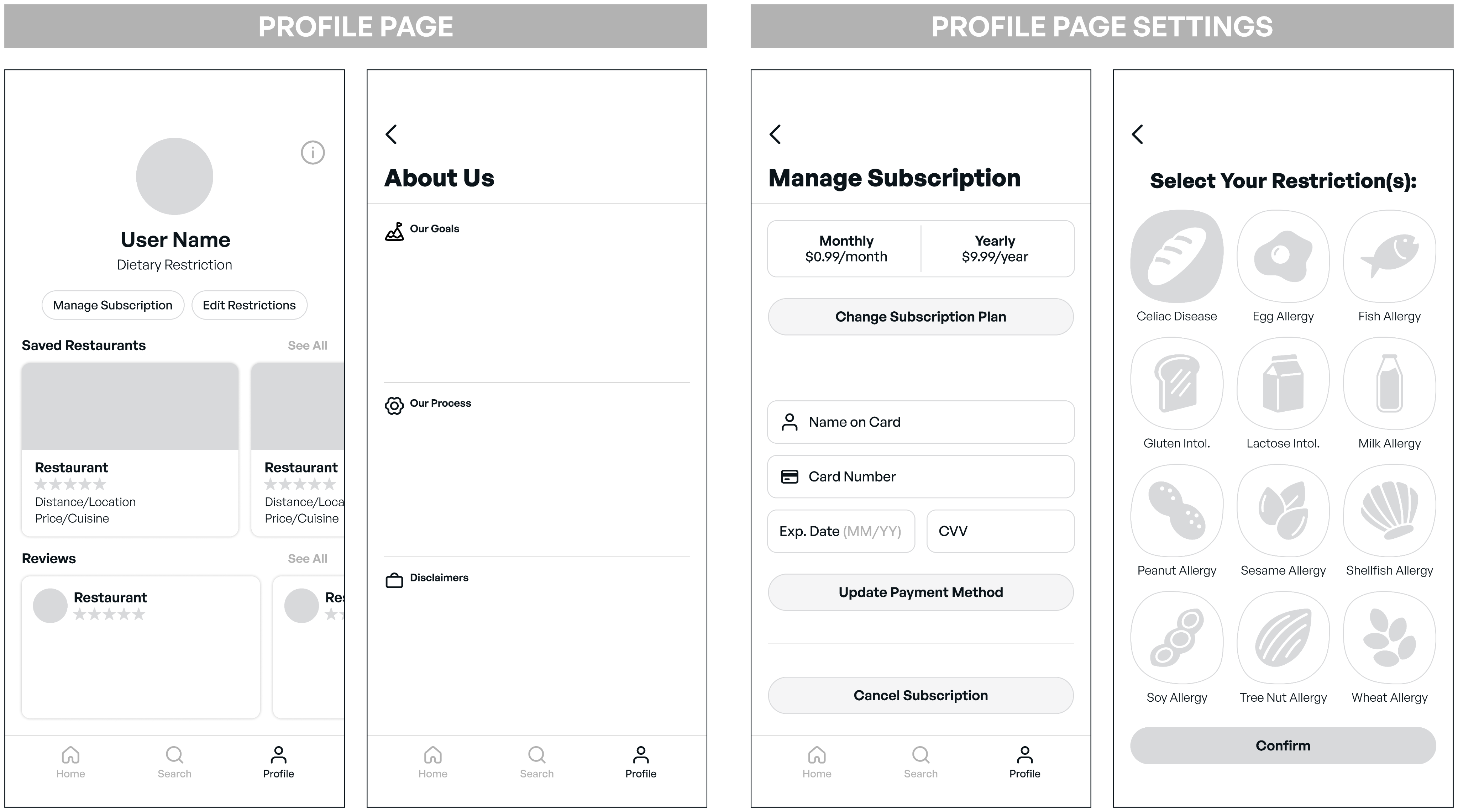
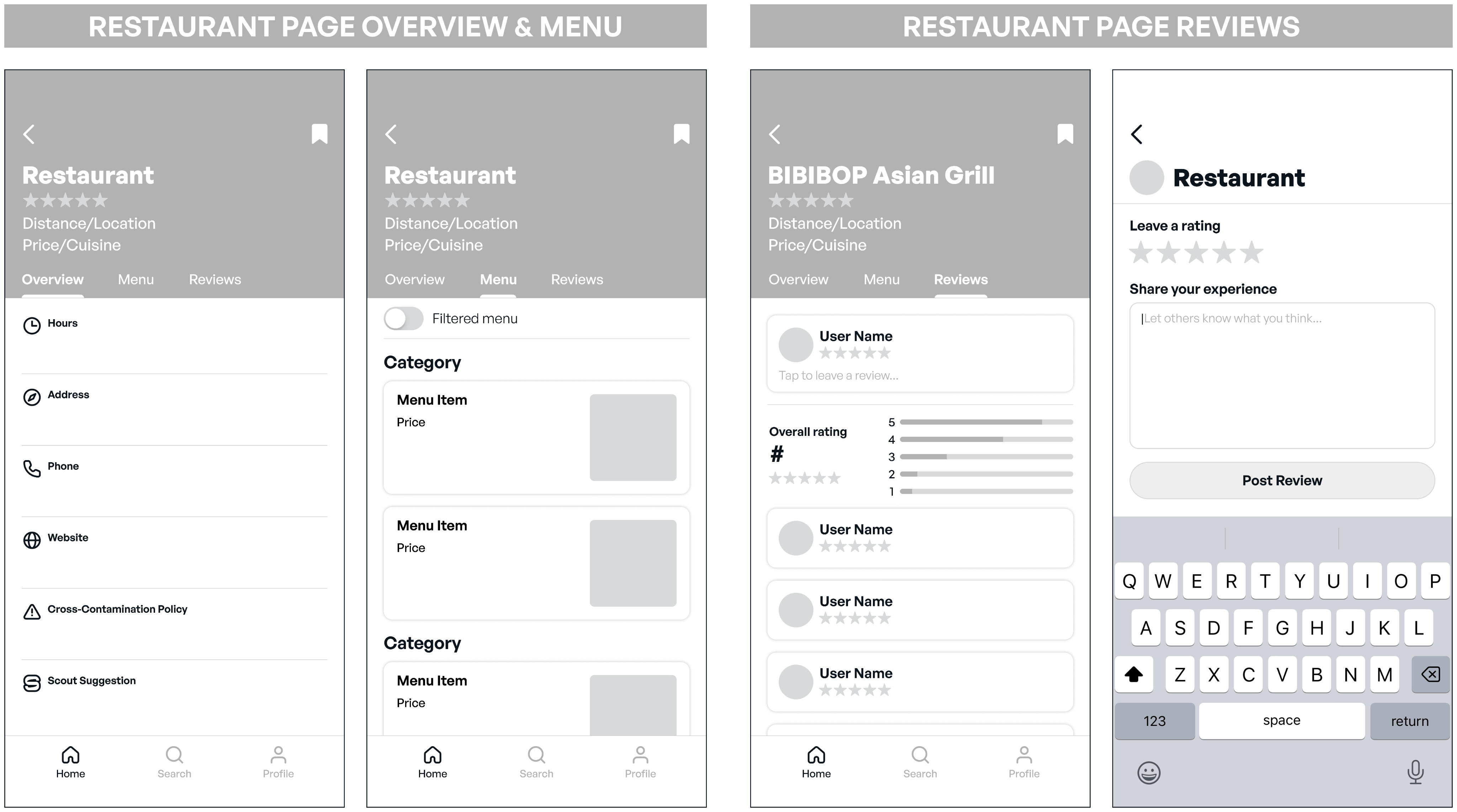
This phase focused on building out the remaining pages and introducing more detail throughout the app. Doing so helped establish a clearer visual hierarchy and understanding of how information would be presented.
Focus on Familiarity
One of the most valuable pieces of feedback I received was not to shy away from familiar design patterns. By embracing interactions users already understood, the app became easier to navigate and required less effort to learn.
USABILITY TEST 2
Interaction Refinement
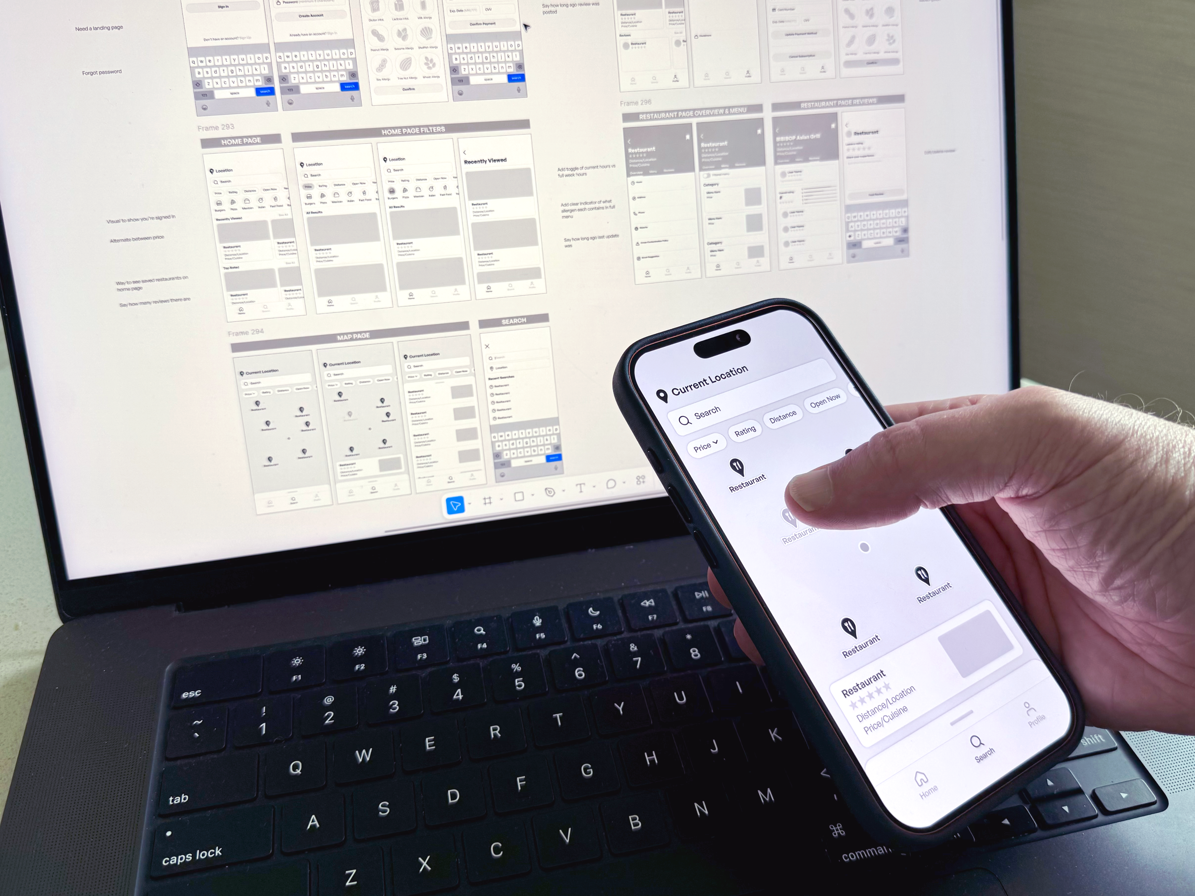
While the overall flow was well received, there was still room to refine the smaller interactions. The importance of additional context became clear, particularly through details like review dates and menu updates that help users make more informed decisions.
BRANDING
Centering Users
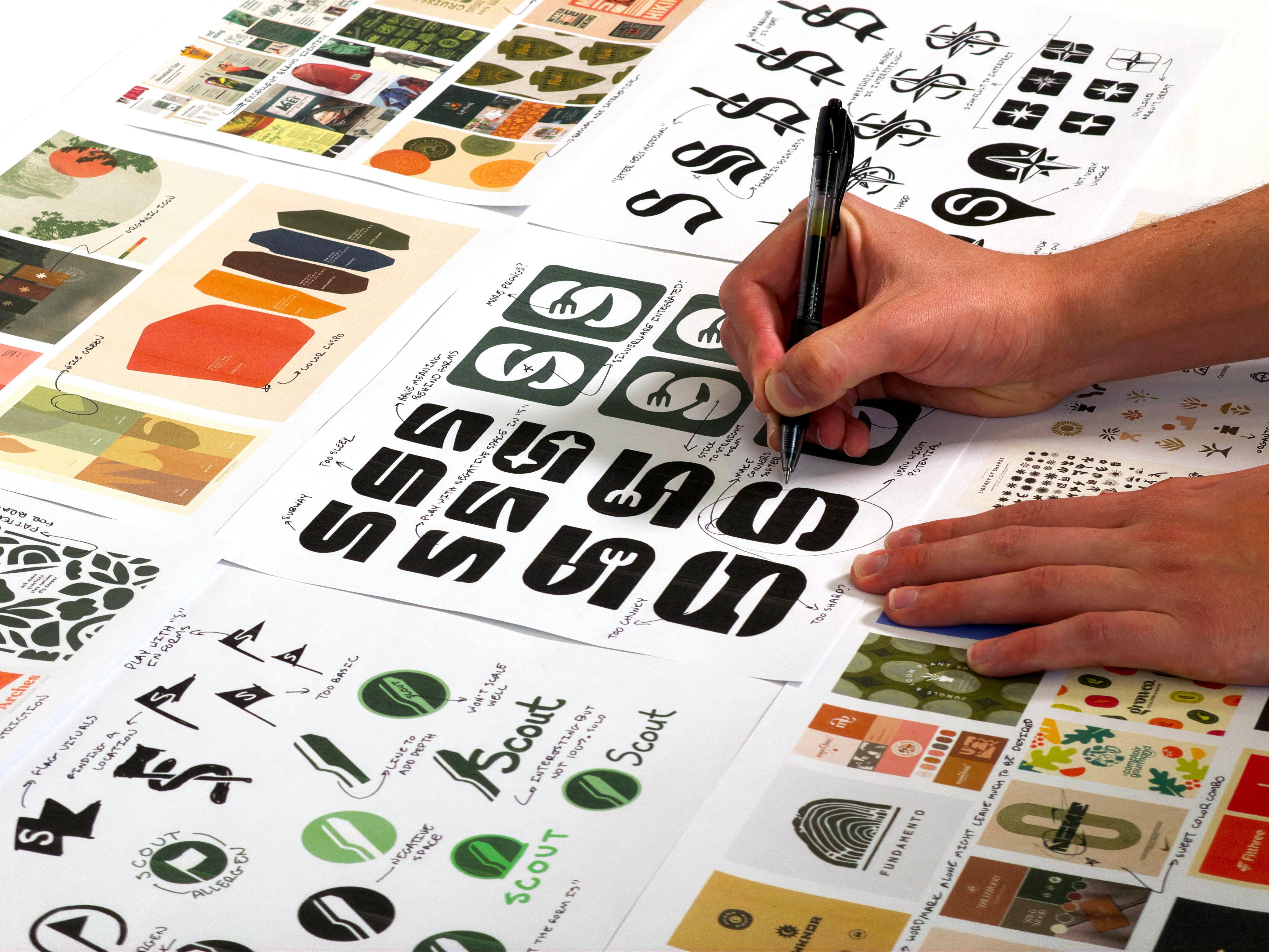
My approach to the branding was to create an experience that felt personal and trustworthy. Building confidence is key for users making dietary decisions, so the identity was designed to reflect an understanding of their unique challenges.
Aesthetic Inspiration
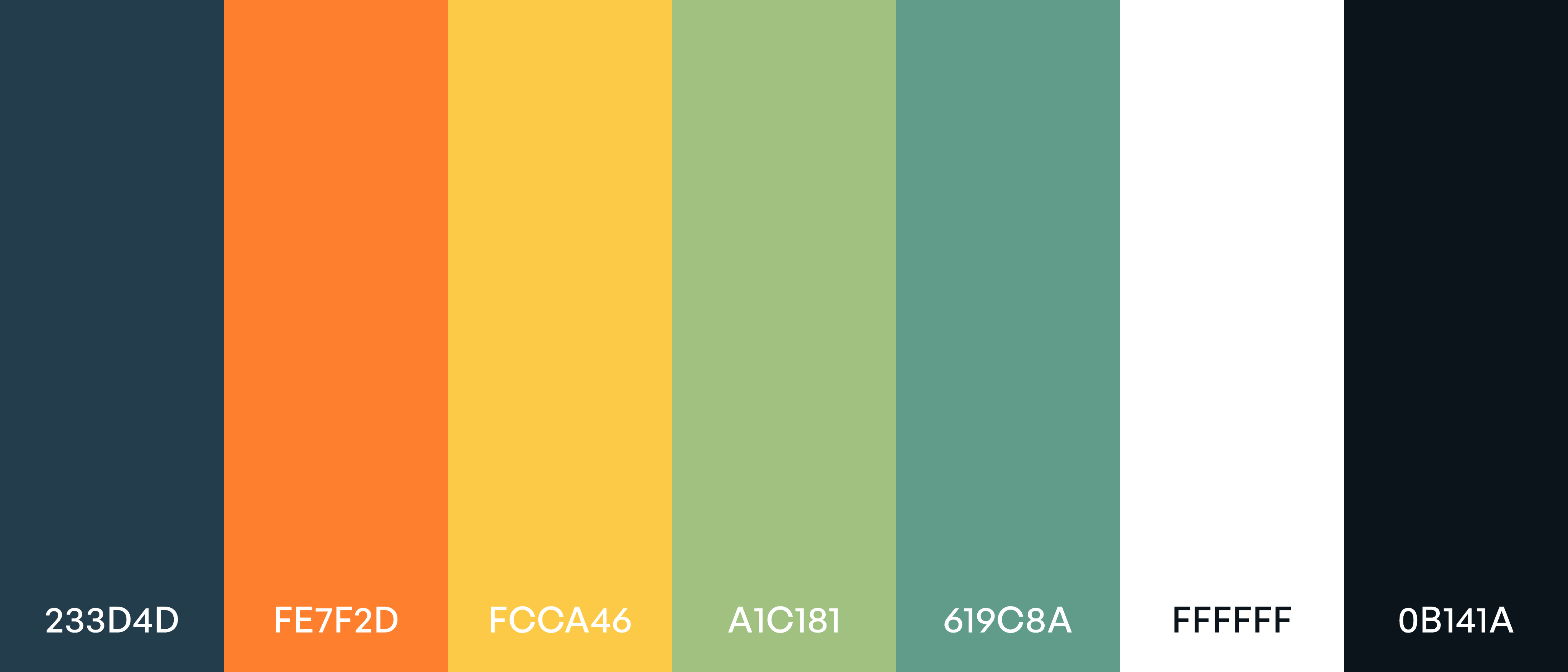
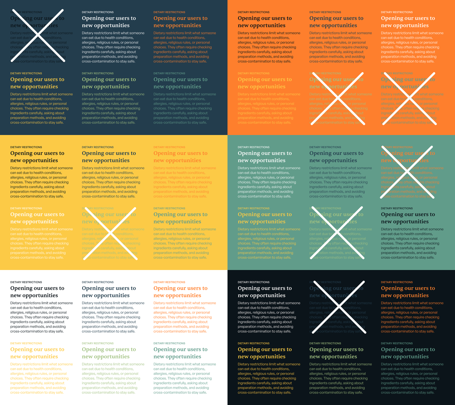
Health-centric colors, organic forms, and simple iconography served as the foundation of the brand. The goal was to clearly communicate the app’s purpose without relying on the expected visual language of the category, creating an identity that feels both familiar and distinct.
Implementation
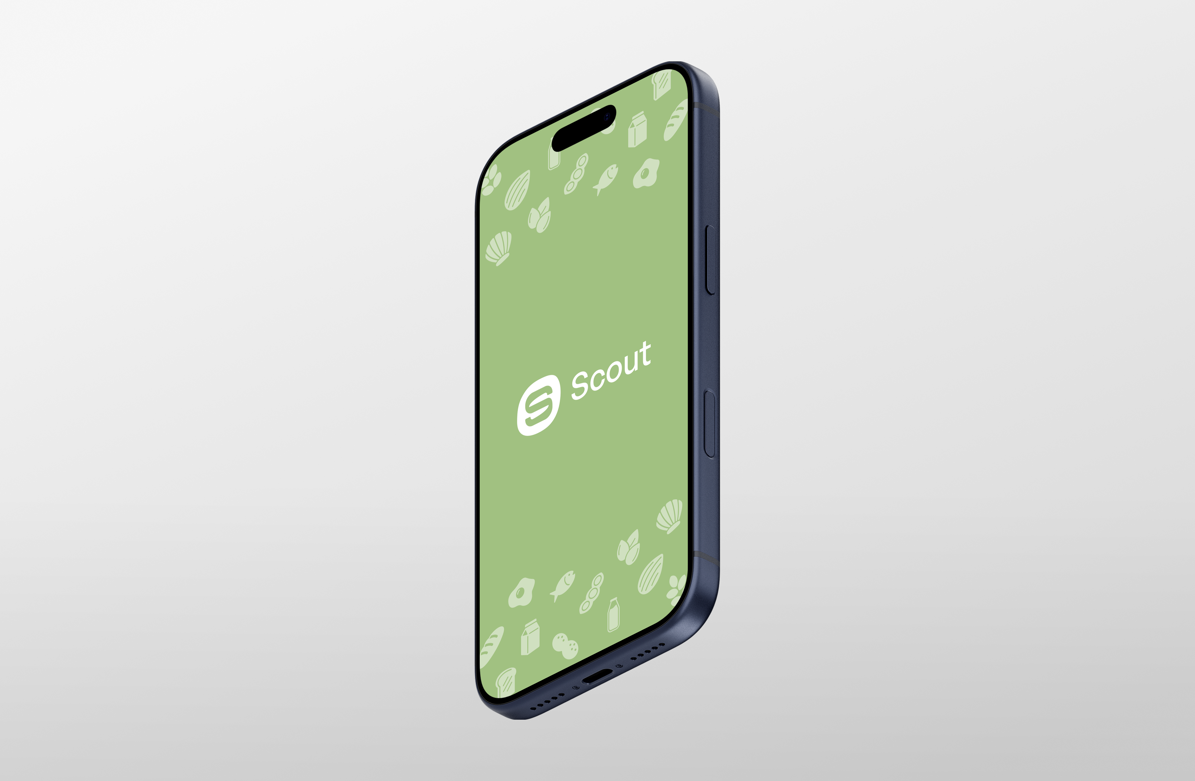
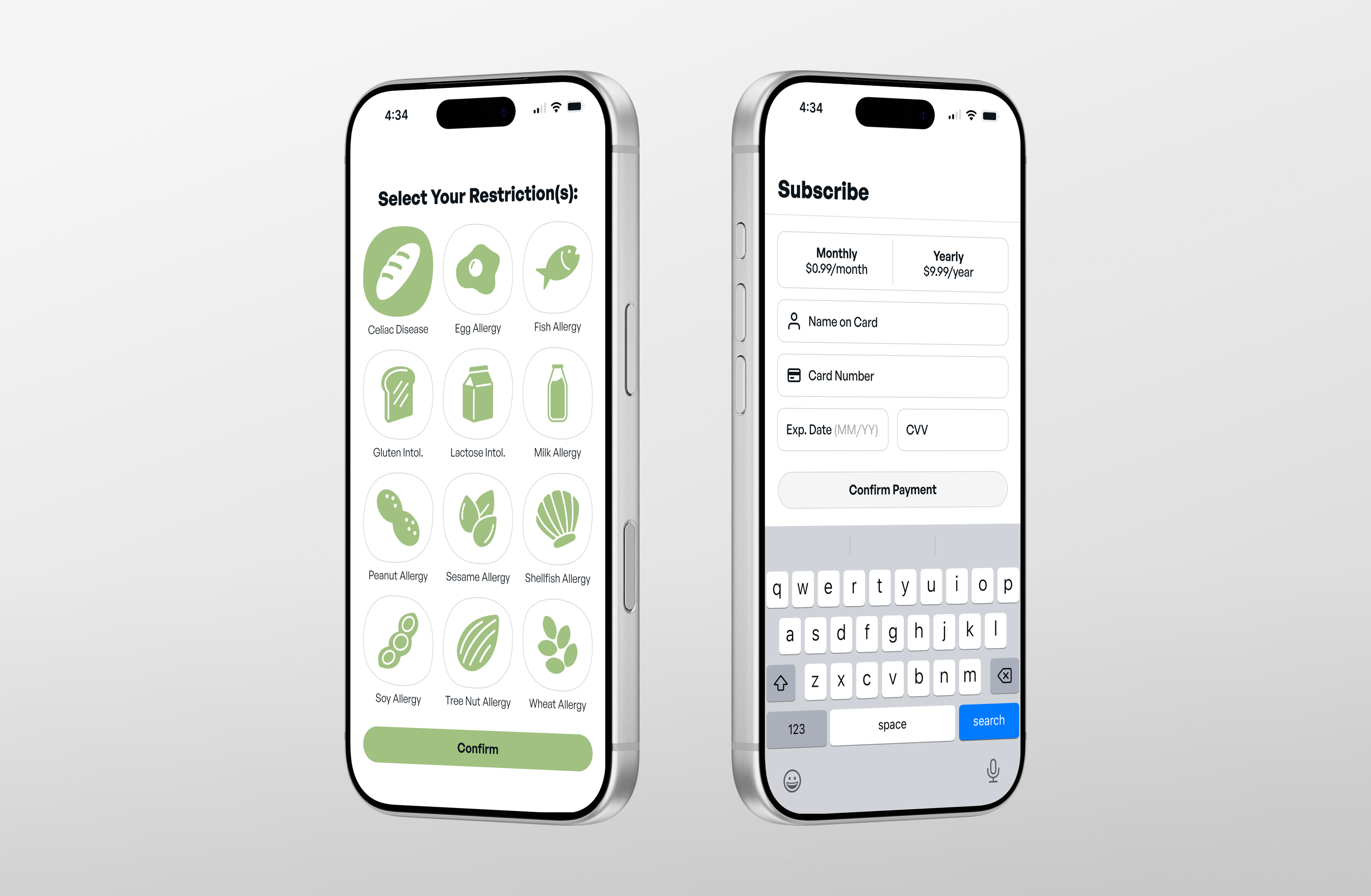
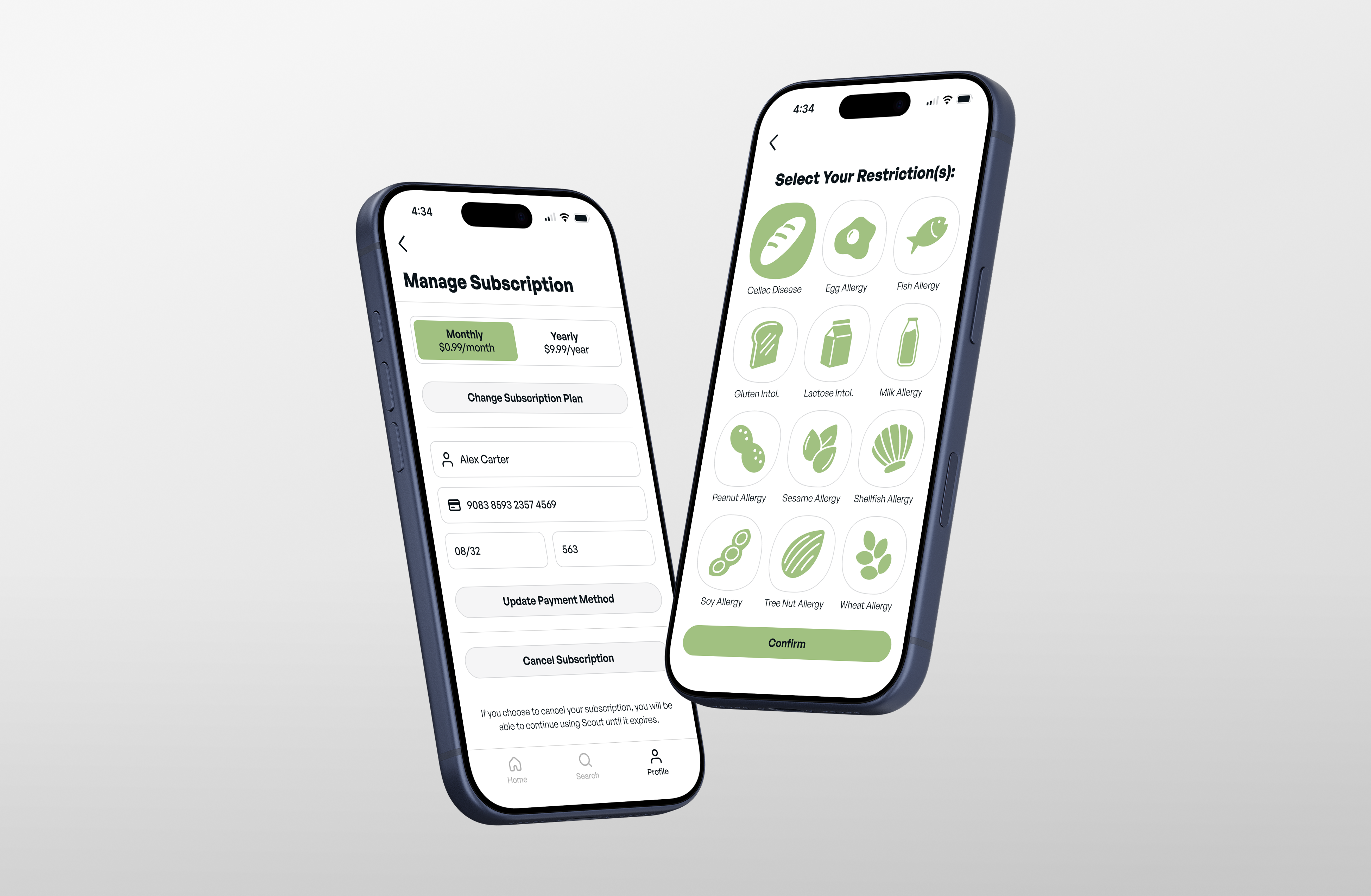
The branding extended beyond the logo to include a visual system for each dietary restriction represented in the app. These elements helped create a more personalized experience while reinforcing the brand’s character.

ONBOARDING
Effortless
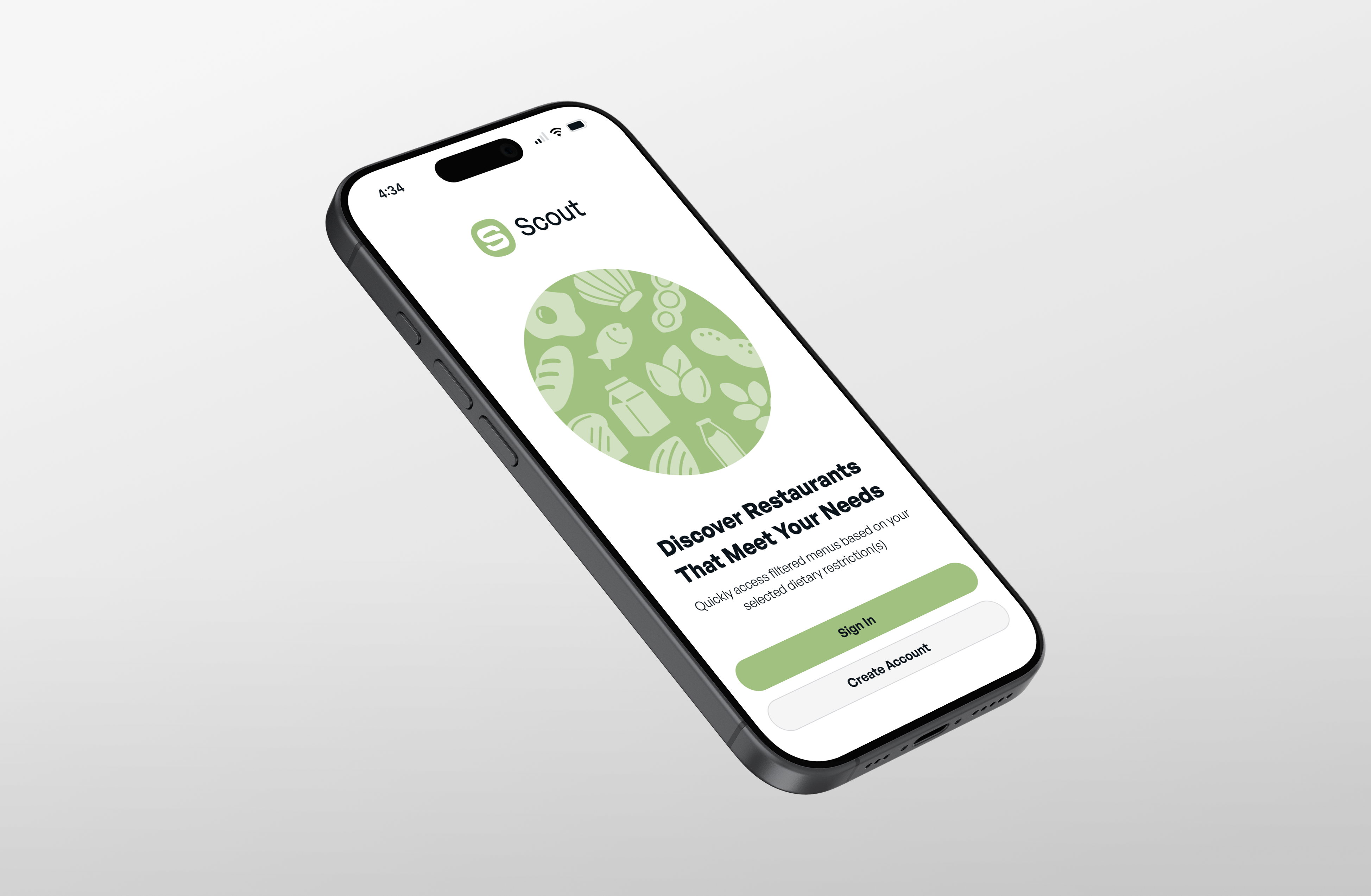
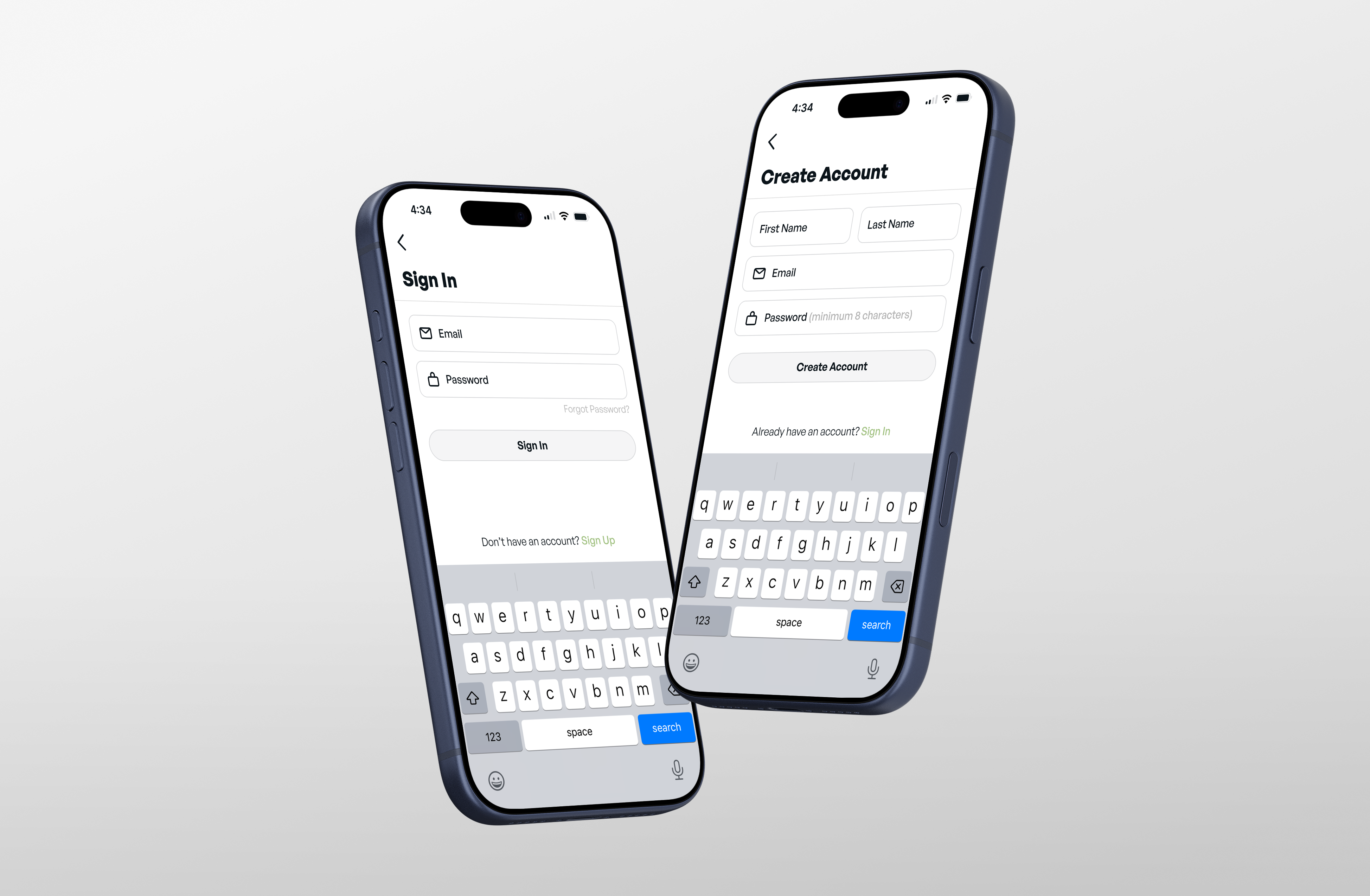
By limiting onboarding to only the information needed to personalize the experience, users can quickly move from downloading the app to finding safe dining options.
HOME
Personal
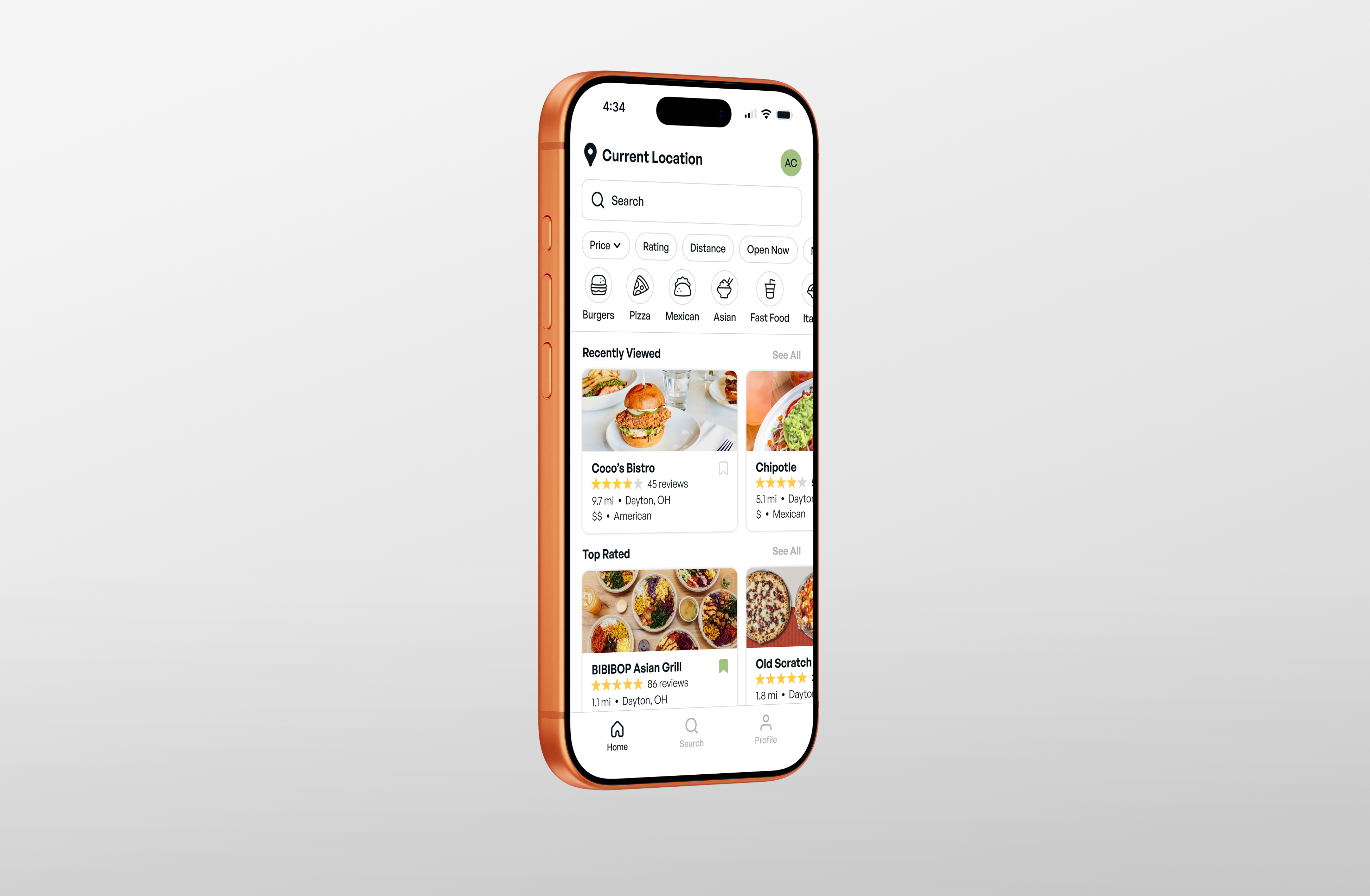
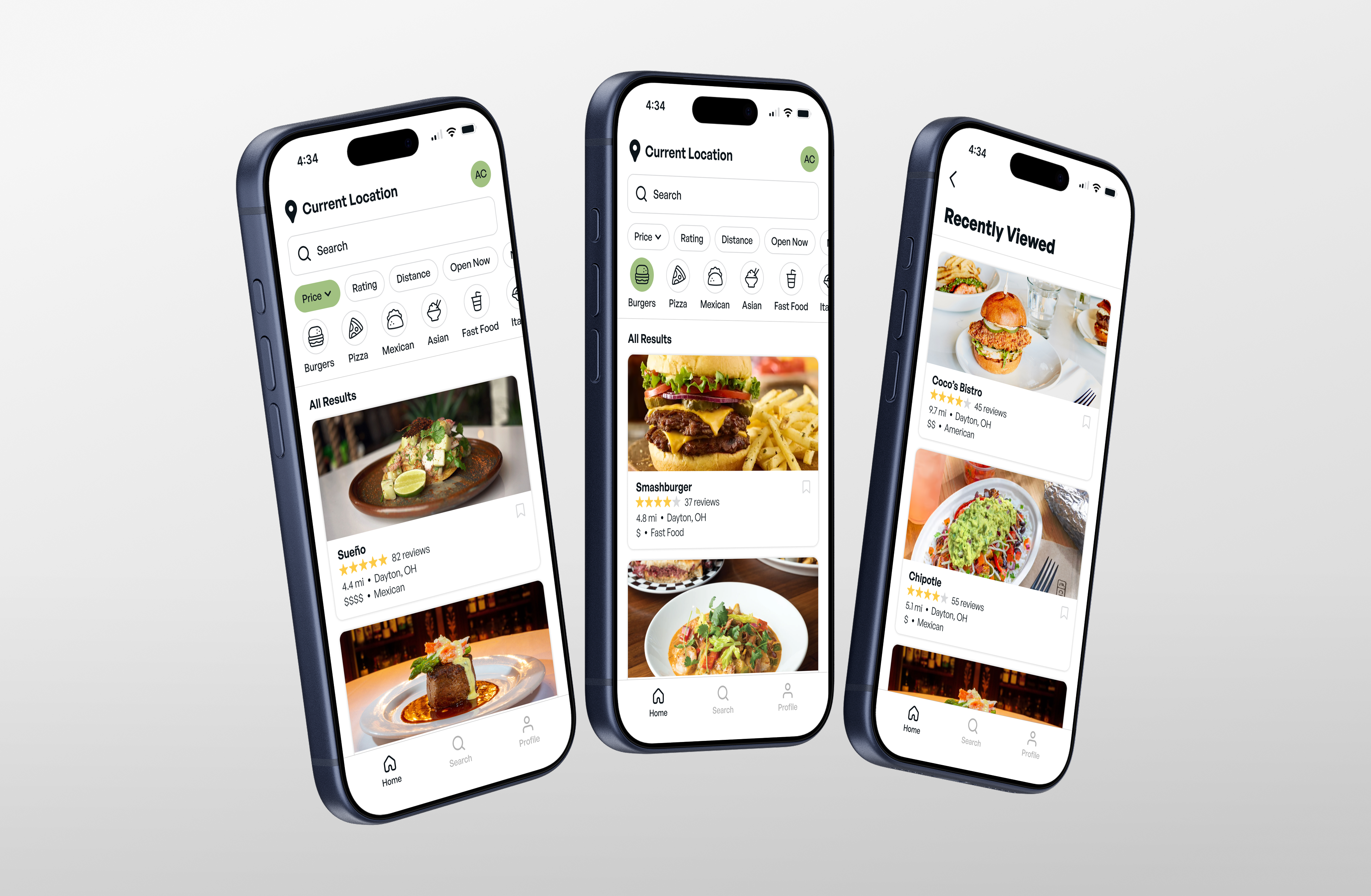
The home page is designed to feel personal, helping users revisit restaurants they enjoy while encouraging new discoveries.
Navigation
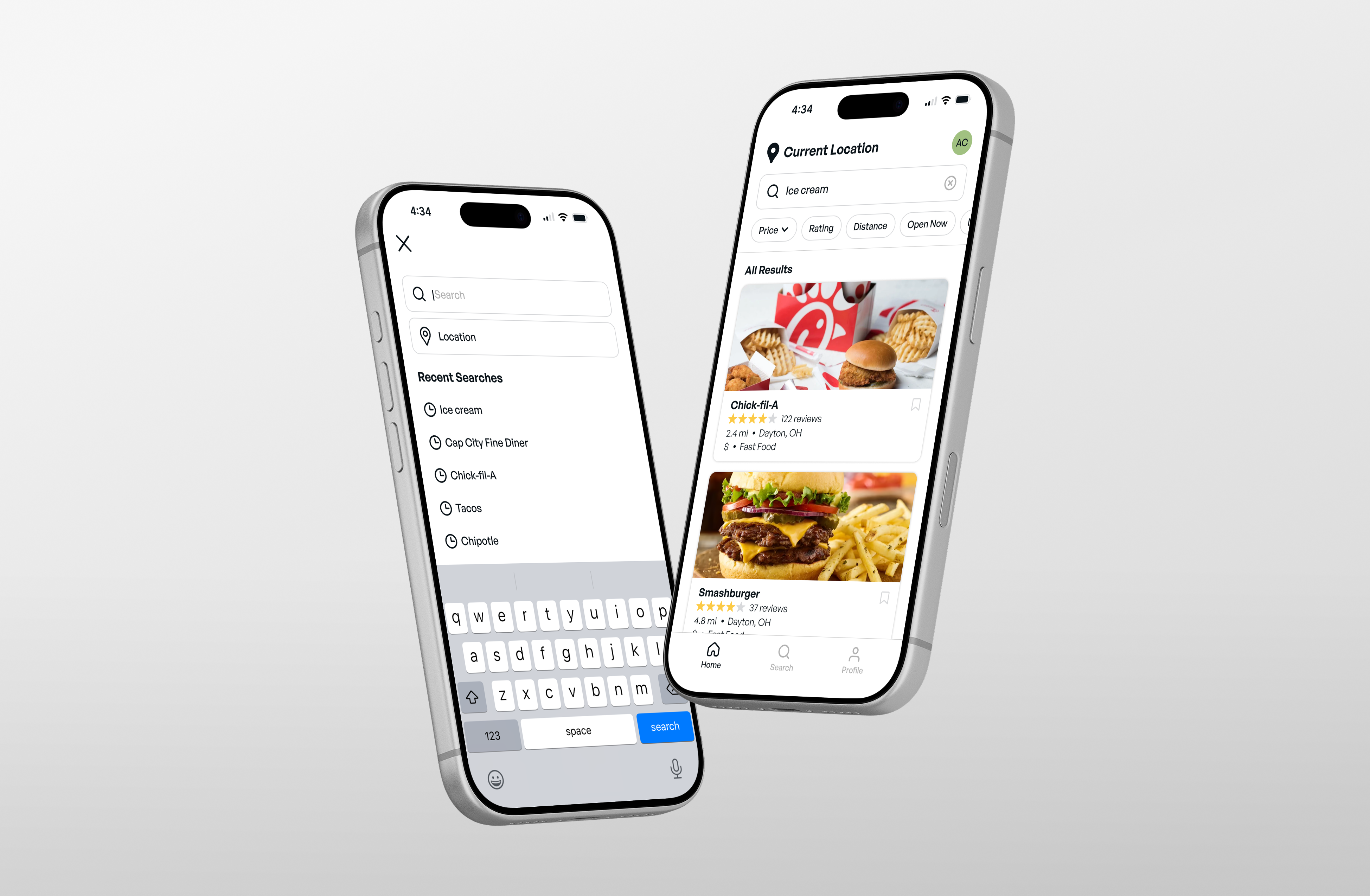
Search tools such as location, filters, and cuisines remain readily accessible, allowing users to quickly narrow their search and find results.
SEARCH
Discovery
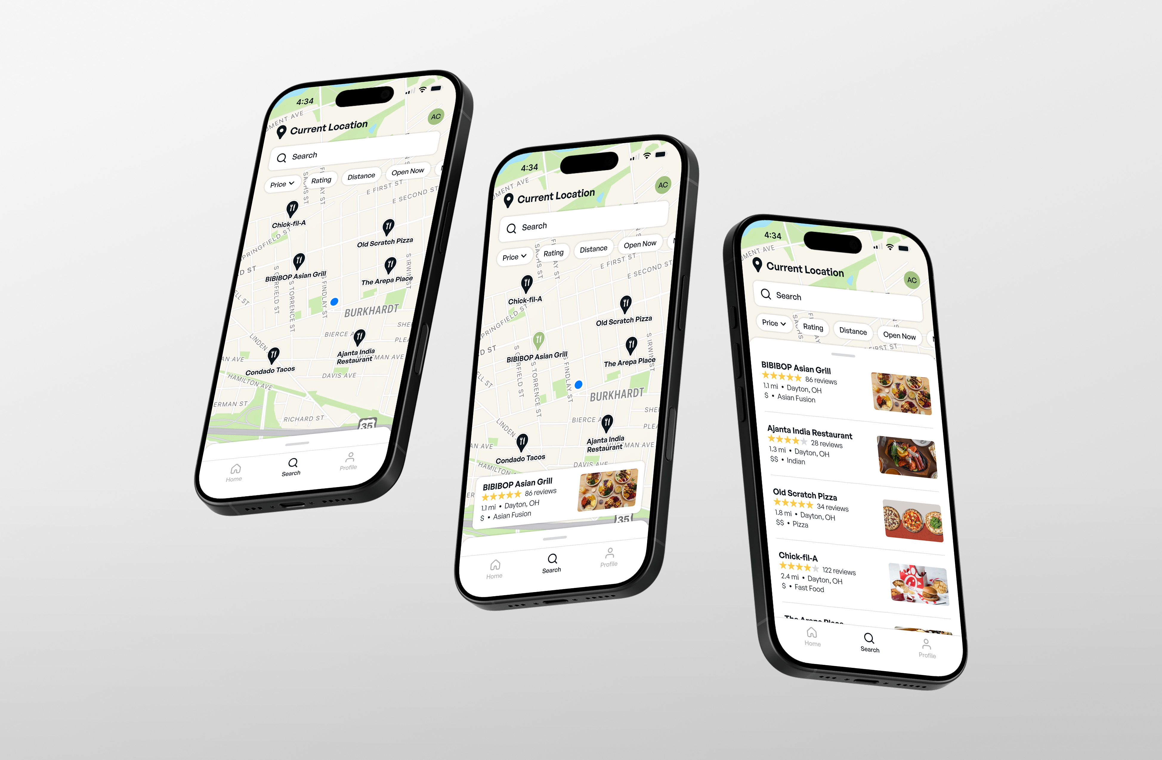
With Apple Maps integration, users can explore nearby restaurants and navigate directly to them without losing access to the filtering tools that make finding safe options easier.
RESTAURANT
Transparency
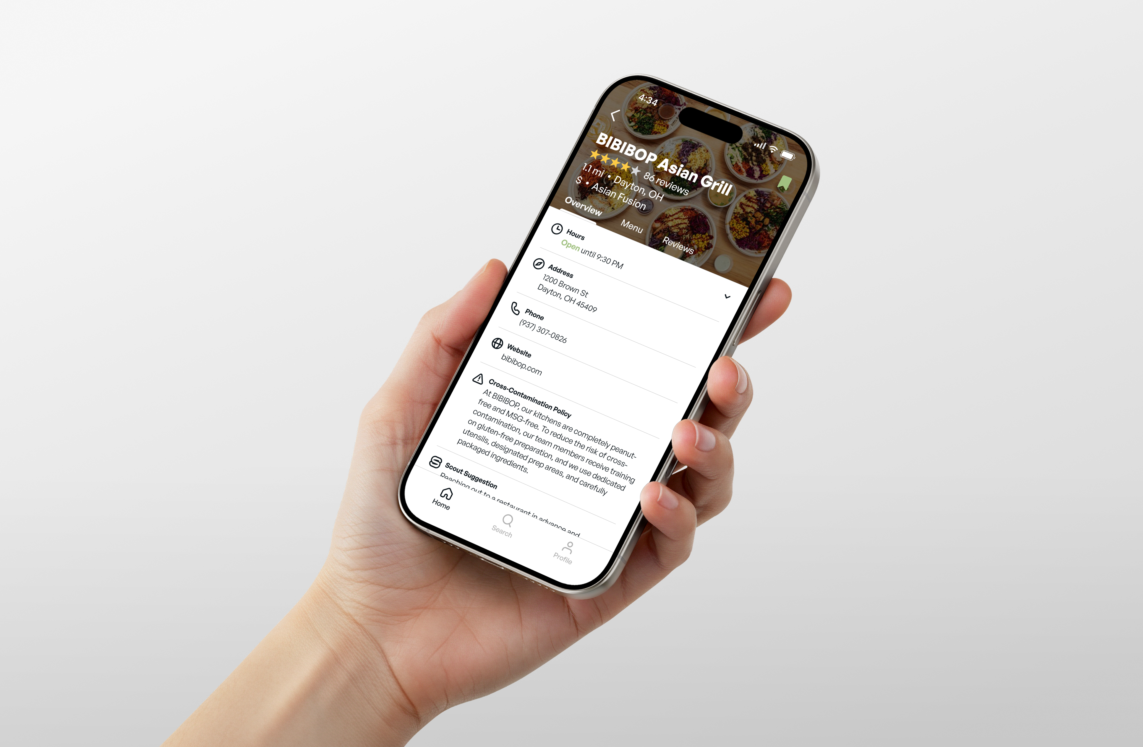
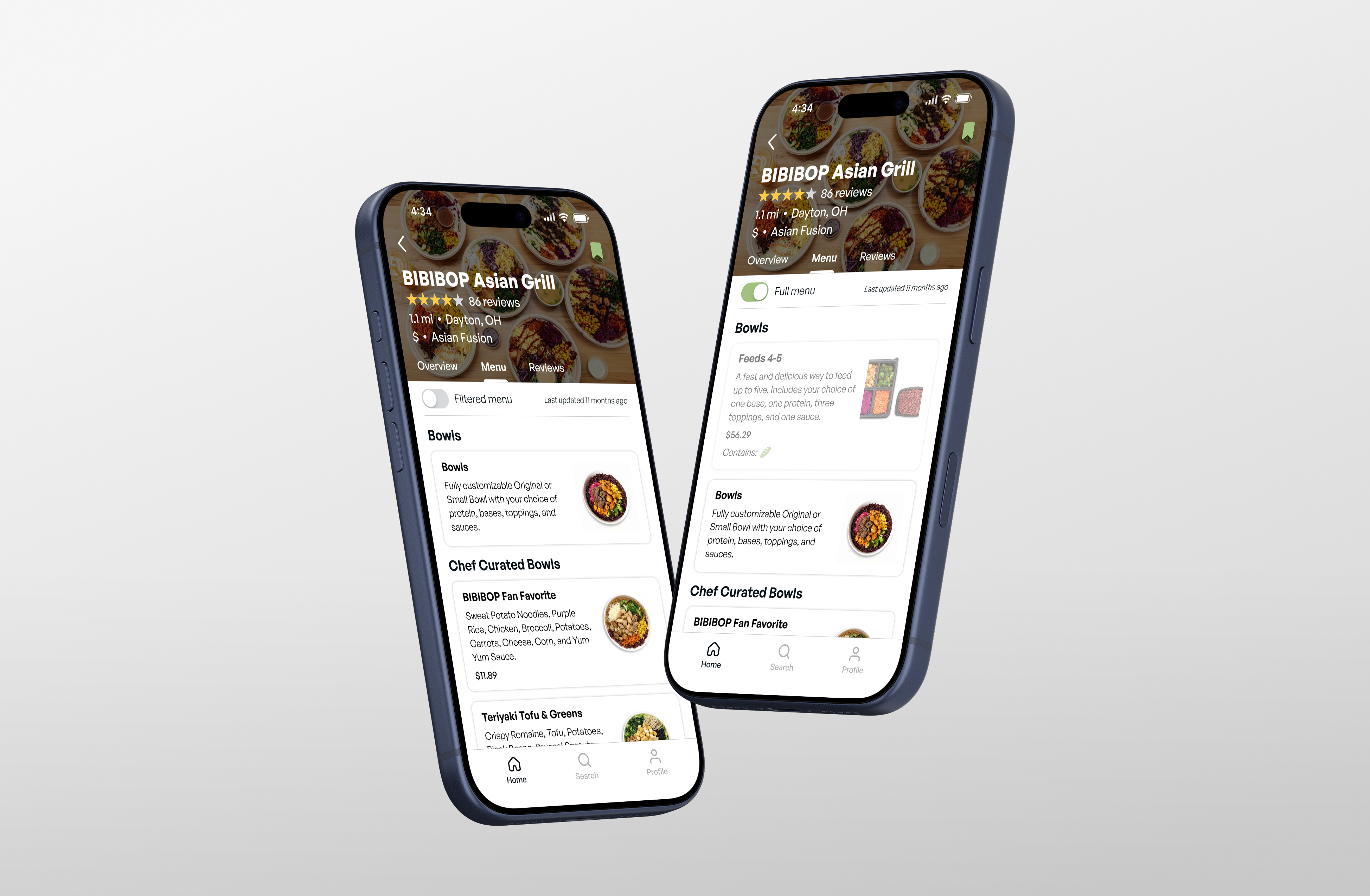
One of the most important features of the app is the ability for restaurants to not only share allergen information, but also their dietary policies. With this information coming directly from the source, users can make dining decisions with greater confidence.
Convenience
Users can seamlessly switch between a menu filtered to their dietary needs and the restaurant’s full menu. This makes it easy to quickly find safe options while still sharing menu items with others.
Community
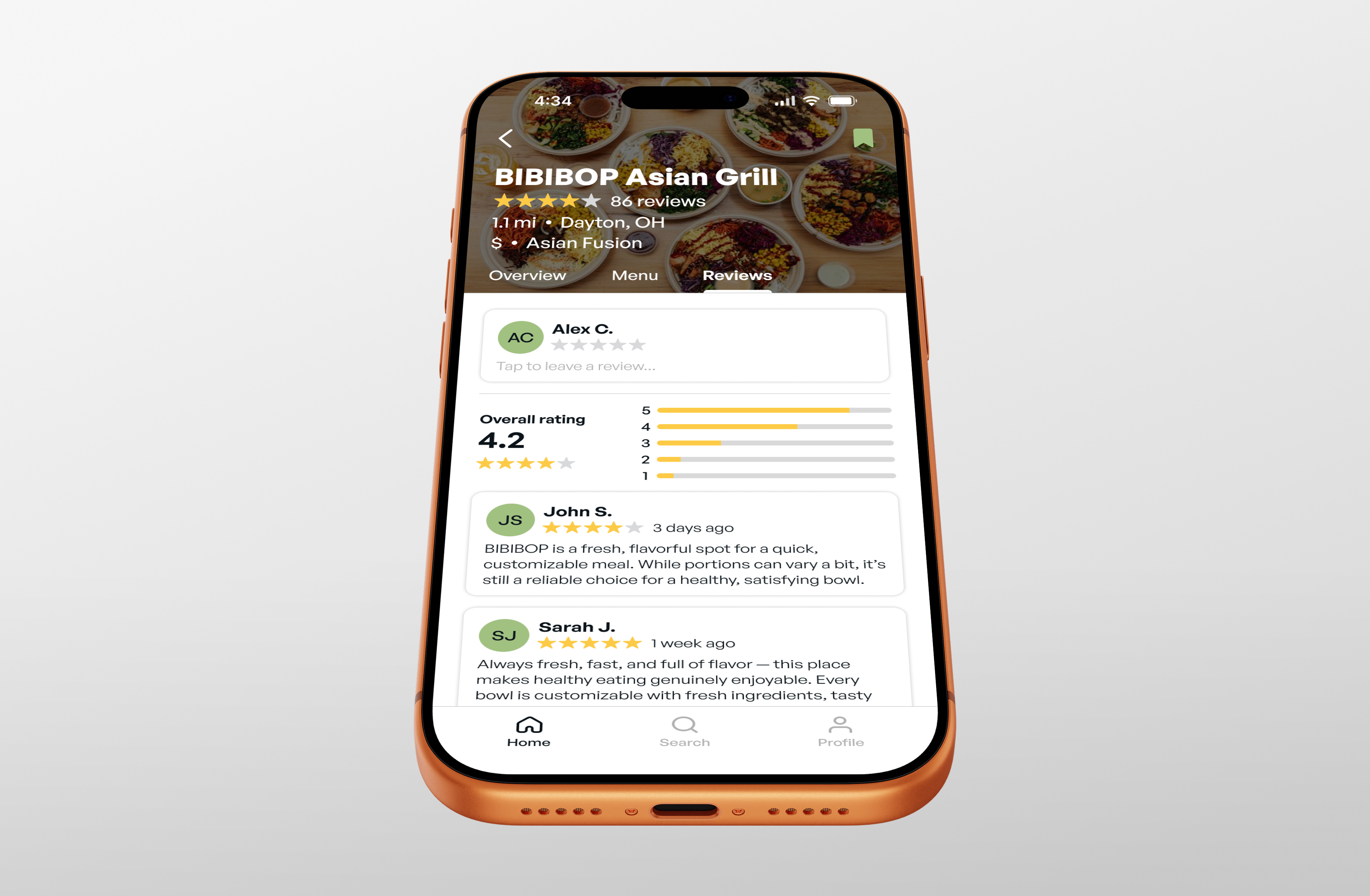
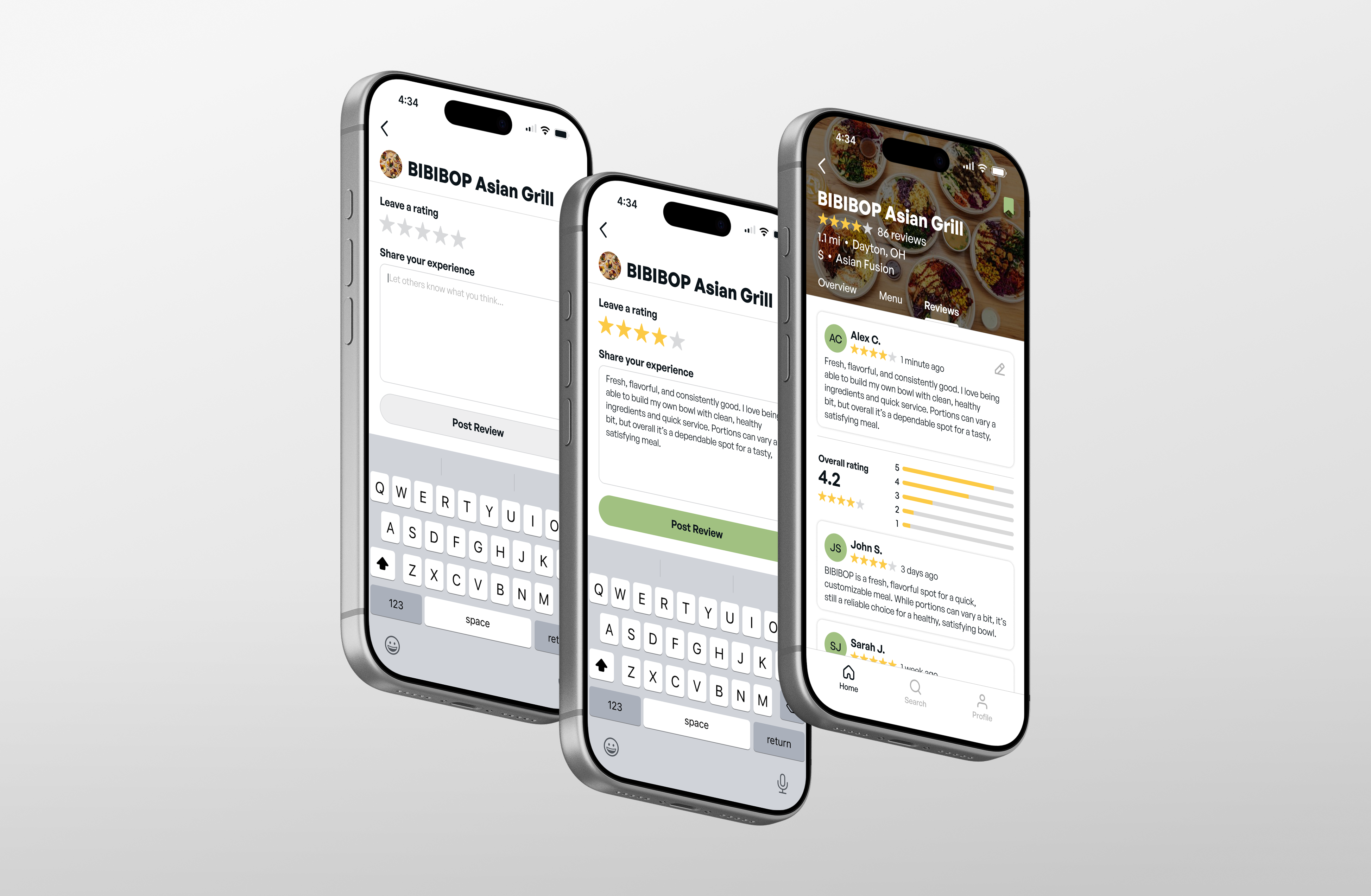
To keep reviews relevant and trustworthy, users only see feedback from others who share their dietary restrictions. This helps prevent confusion and allows users to make decisions based on experiences that closely reflect their own.
PROFILE
Control
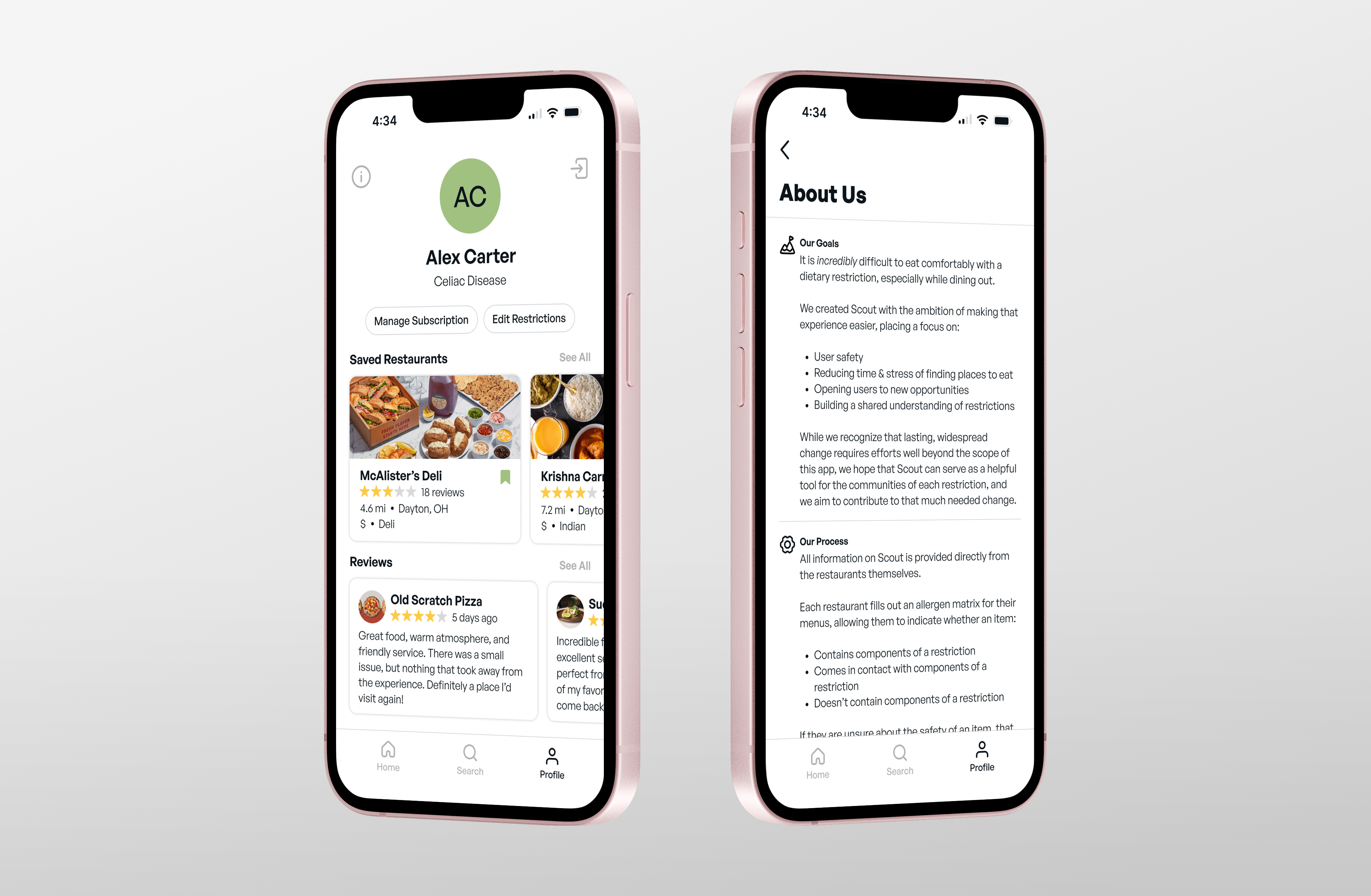
Managing dietary preferences, revisiting trusted restaurants, and keeping track of experiences are all brought together in a single location.


It is incredibly difficult to eat comfortably with a dietary restriction, especially while dining out. Scout is an app that aims to make this experience easier, placing a focus on user needs and transparent communication.
Duration
16 weeks
Disciplines
UX/UI Design
Wireframes
Prototype
CONTEXT
First-Hand Experience
This project was inspired by a friend’s Celiac Disease diagnosis in 2024. The day after their diagnosis, we spent over an hour trying to find a restaurant they felt safe eating at. It didn’t take long for us to realize that this struggle never really goes away, and it’s still a massive challenge for them to this day.
MARKET RESEARCH
Casting a Wide Net
In researching Celiac Disease, I quickly discovered that food allergy and dietary restriction communities were far larger than I had expected, and that many people faced similar challenges when dining out.
Identifying Differences
Food allergies and dietary restrictions are often grouped together, but they can differ significantly. Factors such as reaction severity and cross-contamination risks vary greatly.
COMPETITIVE ANALYSIS
Fragmented & Limited
While resources do exist for these communities, they are extremely limited in both functionality and reach. There is currently no single place people can turn to for reliable help finding safe dining options.
Building Connections
One of the most valuable features offered by existing apps is their ability to connect users directly with restaurants. Clear communication and direct access to information can go far in building trust.
AFFINITY DIAGRAMS
Thorough Analysis
To see what was already working, I took a deep dive into existing apps. This process helped me identify common strengths, recurring pain points, and ideas that could help create a better overall experience.
The Opportunity
Most options currently rely on crowdsourced information, which can be inconsistent and inaccurate. By sourcing dietary-filtered menu information directly from restaurants, a more reliable connection could be created between restaurants and these communities.
DESIGN GOALS
Convenience
Significantly reduce the time spent searching for food.
Safety
Ensure users can dine out without any risk to their health.
Confidence
Offer a return to normalcy in the dining experience.
INFORMATION ARCHITECTURE
Simplicity
My primary aim with this initial mapping was to keep interactions intuitive so users could spend as little time as possible searching for food.
CONCEPTUALIZATION
Effective Arrangement
I found it extremely beneficial to keep similar features in the same location across pages. Consistency throughout the app will help users quickly find important information.
LOW-FIDELITY PROTOTYPE
Understanding User Flow
As the prototype began to take shape, it became clear that too much information could easily overwhelm users. The challenge was deciding what information was essential and what could be removed to keep the experience focused.
USABILITY TEST 1
Attention to Detail
One of the biggest takeaways was the importance of intentional design decisions. Consistent layouts and visual patterns were well received, reinforcing the need to maintain a cohesive experience across the app.
MID-FIDELITY PROTOTYPE
Expanding Structure
This phase focused on building out the remaining pages and introducing more detail throughout the app. Doing so helped establish a clearer visual hierarchy and understanding of how information would be presented.
Focus on Familiarity
One of the most valuable pieces of feedback I received was not to shy away from familiar design patterns. By embracing interactions users already understood, the app became easier to navigate and required less effort to learn.
USABILITY TEST 2
Interaction Refinement
While the overall flow was well received, there was still room to refine the smaller interactions. The importance of additional context became clear, particularly through details like review dates and menu updates that help users make more informed decisions.
BRANDING
Centering Users
My approach to the branding was to create an experience that felt personal and trustworthy. Building confidence is key for users making dietary decisions, so the identity was designed to reflect an understanding of their unique challenges.
Aesthetic Inspiration
Health-centric colors, organic forms, and simple iconography served as the foundation of the brand. The goal was to clearly communicate the app’s purpose without relying on the expected visual language of the category, creating an identity that feels both familiar and distinct.
Implementation
The branding extended beyond the logo to include a visual system for each dietary restriction represented in the app. These elements helped create a more personalized experience while reinforcing the brand’s character.
ONBOARDING
Effortless
By limiting onboarding to only the information needed to personalize the experience, users can quickly move from downloading the app to finding safe dining options.
HOME
Personal
The home page is designed to feel personal, helping users revisit restaurants they enjoy while encouraging new discoveries.
Navigation
Search tools such as location, filters, and cuisines remain readily accessible, allowing users to quickly narrow their search and find results.
SEARCH
Discovery
With Apple Maps integration, users can explore nearby restaurants and navigate directly to them without losing access to the filtering tools that make finding safe options easier.
RESTAURANT
Transparency
One of the most important features of the app is the ability for restaurants to not only share allergen information, but also their dietary policies. With this information coming directly from the source, users can make dining decisions with greater confidence.
Convenience
Users can seamlessly switch between a menu filtered to their dietary needs and the restaurant’s full menu. This makes it easy to quickly find safe options while still sharing menu items with others.
Community
To keep reviews relevant and trustworthy, users only see feedback from others who share their dietary restrictions. This helps prevent confusion and allows users to make decisions based on experiences that closely reflect their own.
PROFILE
Control
Managing dietary preferences, revisiting trusted restaurants, and keeping track of experiences are all brought together in a single location.

Ewan Limrick
Designing original solutions grounded in user insight.


317.273.9373
ewanlimrick@outlook.com

It is incredibly difficult to eat comfortably with a dietary restriction, especially while dining out. Scout is an app that aims to make this experience easier, placing a focus on user needs and transparent communication.
Duration
16 weeks
Disciplines
UX/UI Design
Wireframes
Prototype
CONTEXT
First-Hand Experience
This project was inspired by a friend’s Celiac Disease diagnosis in 2024. The day after their diagnosis, we spent over an hour trying to find a restaurant they felt safe eating at. It didn’t take long for us to realize that this struggle never really goes away, and it’s still a massive challenge for them to this day.
MARKET RESEARCH
Casting a Wide Net
In researching Celiac Disease, I quickly discovered that food allergy and dietary restriction communities were far larger than I had expected, and that many people faced similar challenges when dining out.
Identifying Differences
Food allergies and dietary restrictions are often grouped together, but they can differ significantly. Factors such as reaction severity and cross-contamination risks vary greatly.
COMPETITIVE ANALYSIS
Fragmented & Limited
While resources do exist for these communities, they are extremely limited in both functionality and reach. There is currently no single place people can turn to for reliable help finding safe dining options.
Building Connections
One of the most valuable features offered by existing apps is their ability to connect users directly with restaurants. Clear communication and direct access to information can go far in building trust.
AFFINITY DIAGRAMS
Thorough Analysis
To see what was already working, I took a deep dive into existing apps. This process helped me identify common strengths, recurring pain points, and ideas that could help create a better overall experience.
The Opportunity
Most options currently rely on crowdsourced information, which can be inconsistent and inaccurate. By sourcing dietary-filtered menu information directly from restaurants, a more reliable connection could be created between restaurants and these communities.
DESIGN GOALS
Convenience
Significantly reduce the time spent searching for food.
Safety
Ensure users can dine out without any risk to their health.
Confidence
Offer a return to normalcy in the dining experience.
INFORMATION ARCHITECTURE
Simplicity
My primary aim with this initial mapping was to keep interactions intuitive so users could spend as little time as possible searching for food.
CONCEPTUALIZATION
Effective Arrangement
I found it extremely beneficial to keep similar features in the same location across pages. Consistency throughout the app will help users quickly find important information.
LOW-FIDELITY PROTOTYPE
Understanding User Flow
As the prototype began to take shape, it became clear that too much information could easily overwhelm users. The challenge was deciding what information was essential and what could be removed to keep the experience focused.
USABILITY TEST 1
Attention to Detail
One of the biggest takeaways was the importance of intentional design decisions. Consistent layouts and visual patterns were well received, reinforcing the need to maintain a cohesive experience across the app.
MID-FIDELITY PROTOTYPE
Expanding Structure
This phase focused on building out the remaining pages and introducing more detail throughout the app. Doing so helped establish a clearer visual hierarchy and understanding of how information would be presented.
Focus on Familiarity
One of the most valuable pieces of feedback I received was not to shy away from familiar design patterns. By embracing interactions users already understood, the app became easier to navigate and required less effort to learn.
USABILITY TEST 2
Interaction Refinement
While the overall flow was well received, there was still room to refine the smaller interactions. The importance of additional context became clear, particularly through details like review dates and menu updates that help users make more informed decisions.
BRANDING
Centering Users
My approach to the branding was to create an experience that felt personal and trustworthy. Building confidence is key for users making dietary decisions, so the identity was designed to reflect an understanding of their unique challenges.
Aesthetic Inspiration
Health-centric colors, organic forms, and simple iconography served as the foundation of the brand. The goal was to clearly communicate the app’s purpose without relying on the expected visual language of the category, creating an identity that feels both familiar and distinct.
Implementation
The branding extended beyond the logo to include a visual system for each dietary restriction represented in the app. These elements helped create a more personalized experience while reinforcing the brand’s character.
ONBOARDING
Effortless
By limiting onboarding to only the information needed to personalize the experience, users can quickly move from downloading the app to finding safe dining options.
HOME
Personal
The home page is designed to feel personal, helping users revisit restaurants they enjoy while encouraging new discoveries.
Navigation
Search tools such as location, filters, and cuisines remain readily accessible, allowing users to quickly narrow their search and find results.
SEARCH
Discovery
With Apple Maps integration, users can explore nearby restaurants and navigate directly to them without losing access to the filtering tools that make finding safe options easier.
RESTAURANT
Transparency
One of the most important features of the app is the ability for restaurants to not only share allergen information, but also their dietary policies. With this information coming directly from the source, users can make dining decisions with greater confidence.
Convenience
Users can seamlessly switch between a menu filtered to their dietary needs and the restaurant’s full menu. This makes it easy to quickly find safe options while still sharing menu items with others.
Community
To keep reviews relevant and trustworthy, users only see feedback from others who share their dietary restrictions. This helps prevent confusion and allows users to make decisions based on experiences that closely reflect their own.
PROFILE
Control
Managing dietary preferences, revisiting trusted restaurants, and keeping track of experiences are all brought together in a single location.
